Why this project
needed to exist
The project entitled "Control type 2 diabetes. Live in better health and fewer medications" has two main objectives that are strongly interconnected.
The first objective is to provide patients a suitable plan depending on their cases—how they eat, live, and exercise. The second objective is to help patients track their health life to measure where their level of diabetes is.
Need for a suitable plan
Patients need plans tailored to their cases, including how they eat, live, and exercise.
Daily habits that matter
Eating, lifestyle, and exercise routines are core inputs—so the experience must guide those decisions clearly.
Need to track health progress
Patients need help tracking their health over time to understand outcomes and stay aligned.
Measuring diabetes level
To support better outcomes, the experience must help measure where a patient’s diabetes level is.
What we built
for Otida
Otida's solution was designed around four pillars to address the journey’s biggest risks: confusion, lack of comparability, uncertainty, and unnecessary steps.
Clarity
Explain the decision with a hierarchy that answers “what’s next?” before the user asks.
Comparison
Surface differences between options in a way that is fast to scan and easy to trust.
Trust
Use verification, transparency, and reassurance moments to reduce perceived risk.
Speed
Reduce unnecessary steps by pre-filling input where possible and simplifying the path.
Crafting the
mobile experience
The mobile experience is where users decide. We focused on legibility, progressive disclosure, and reassuring microcopy that reduces uncertainty.
Control type 2 diabetes. Live in better health and fewer medications
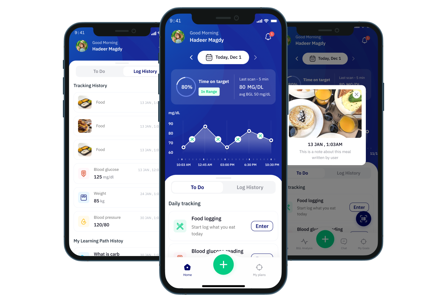
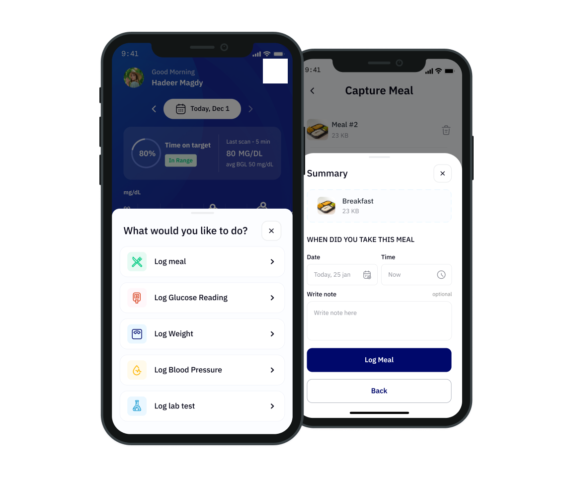
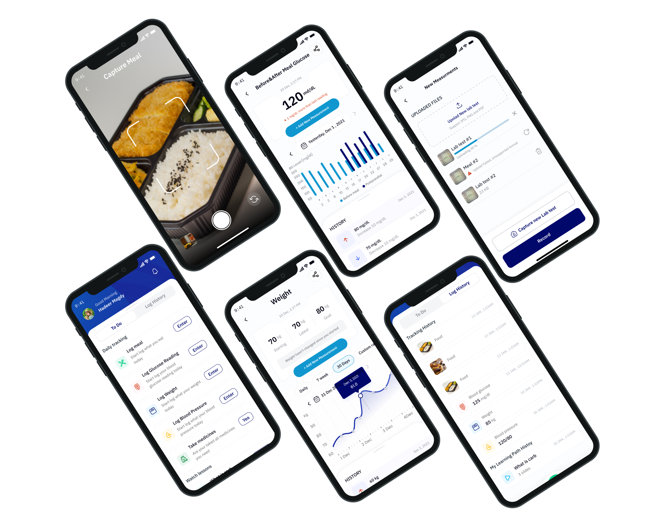
Logging activities
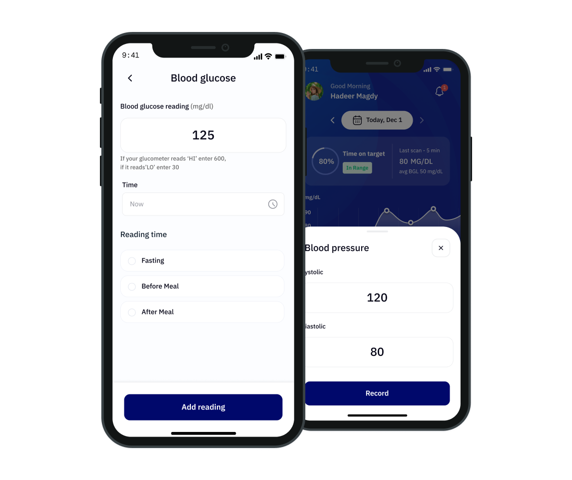
Log what you did like meals, Glucose reading, Weight, Blood Pressure and more.
Logging Glucose and pressure
A record of progress of what happened like HbA1c, Weight, Fasting Glucose and more.
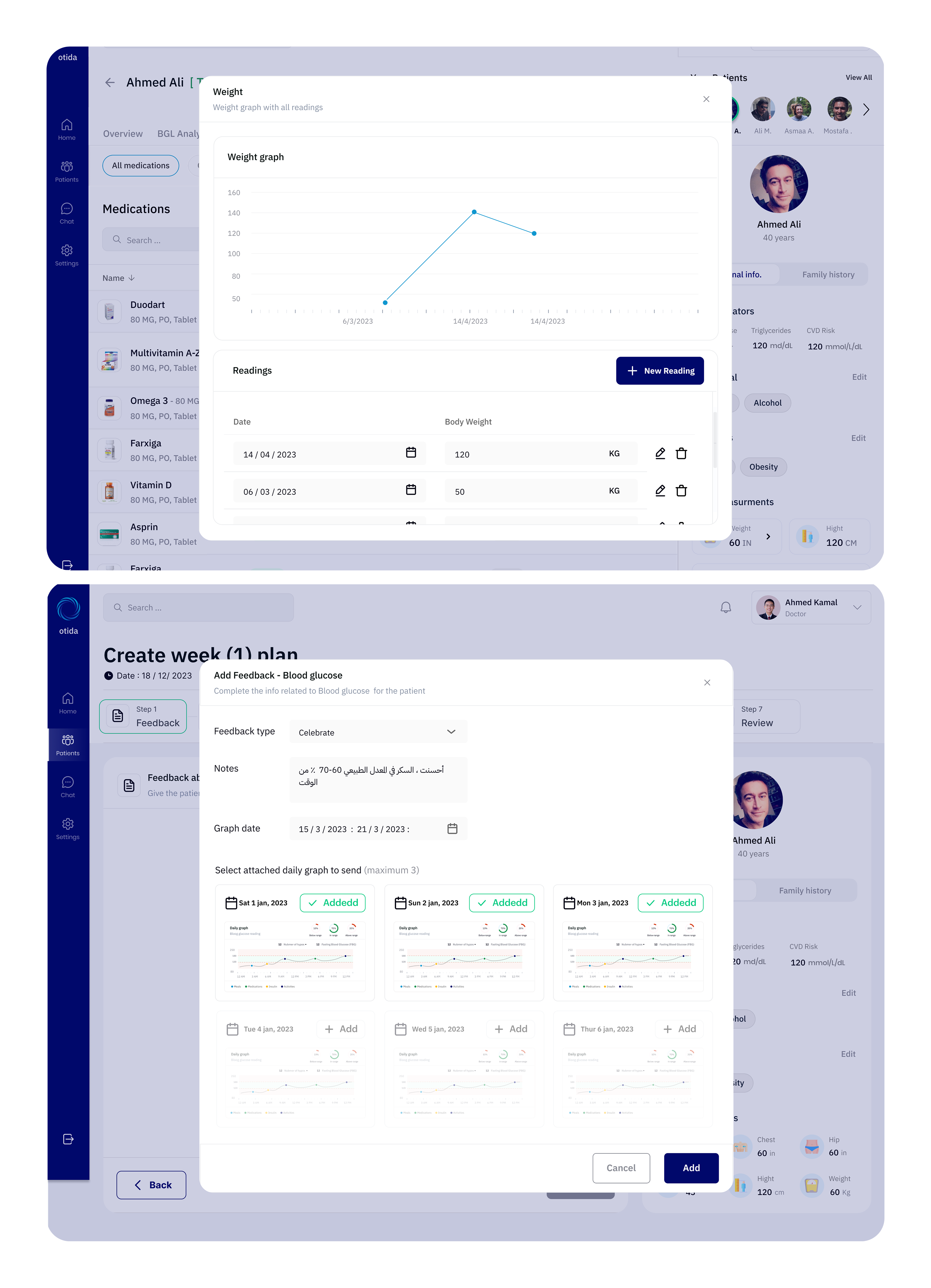
Logging and tracking Weight
Patients tracking their weight progress and activities by adding their weight.
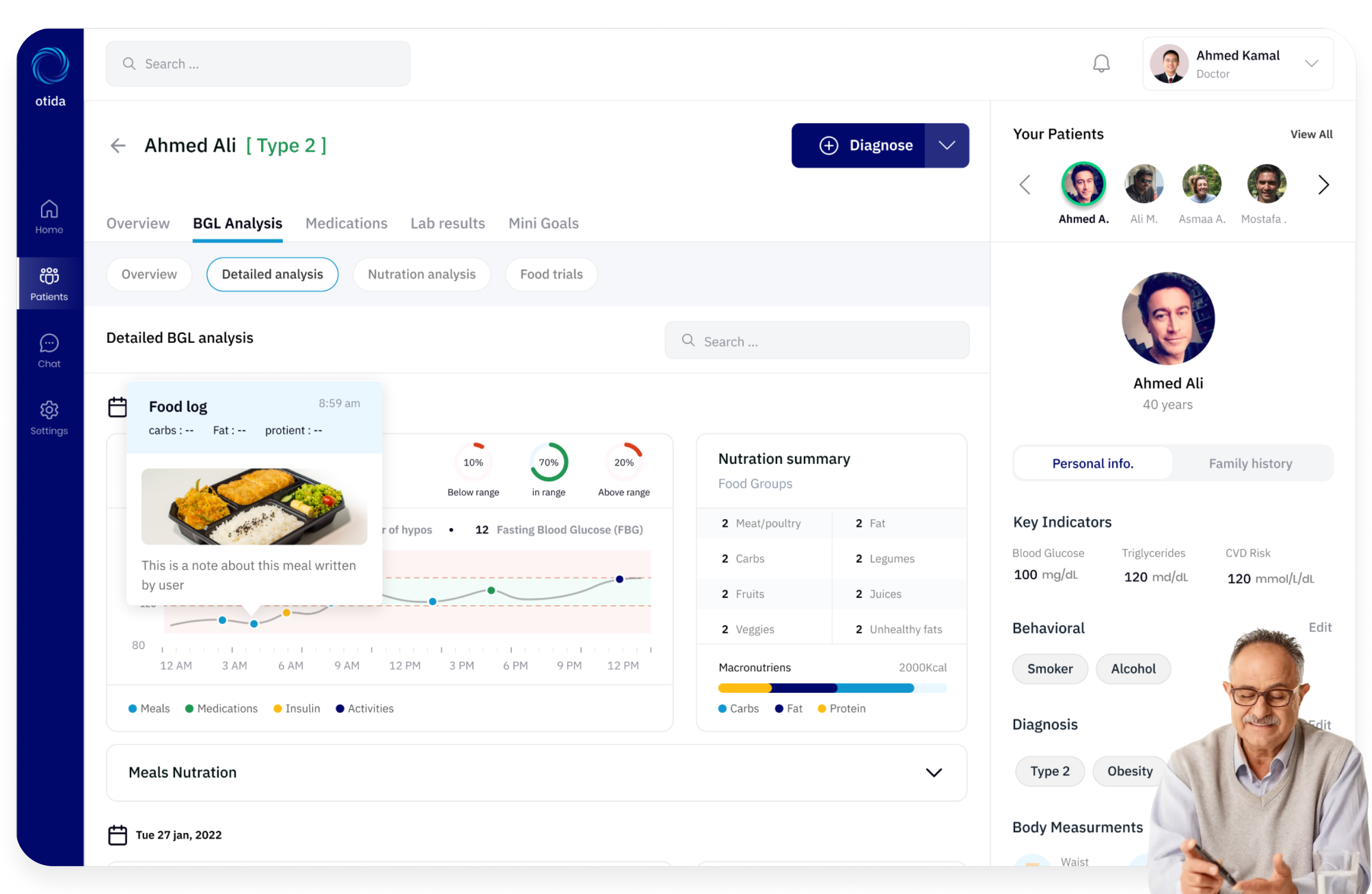
Tracking the data
Tracking the data for patient like fasting glucose, HbA1c, Weight and Before&After meal glucose goes on.
Complete mobile experience
Thank you screen with a final overview of the key mobile interactions and health tracking flows.
Designing the
cross-device experience
We extended the same decision logic to responsive layouts, ensuring the user can compare options and complete the journey comfortably on desktop and mobile web.
Live in better health
and fewer medications
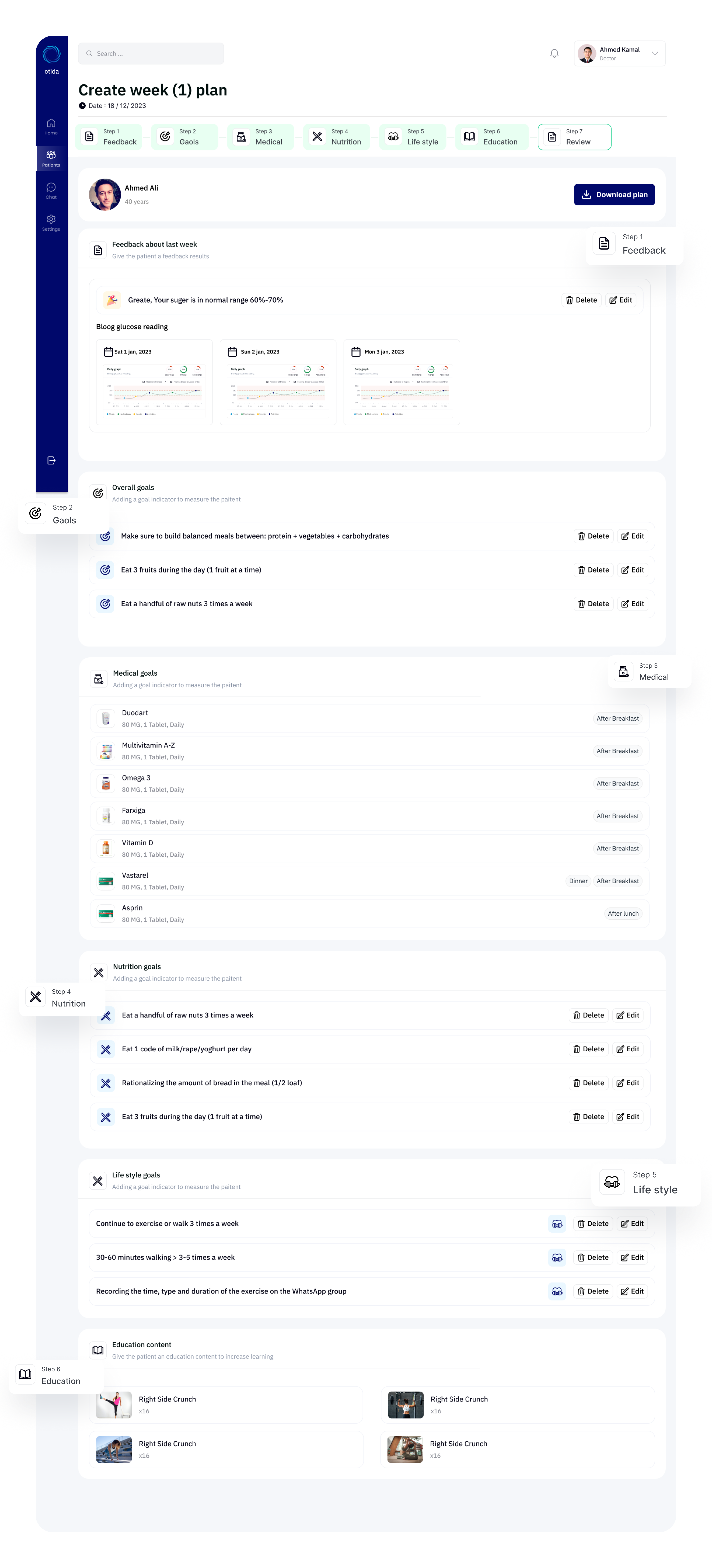
The Otida program will help you reverse diabetes with a well-thought-out plan from a professional medical team, health coaches and nutritionists who rely on the latest technology to treat diabetes.
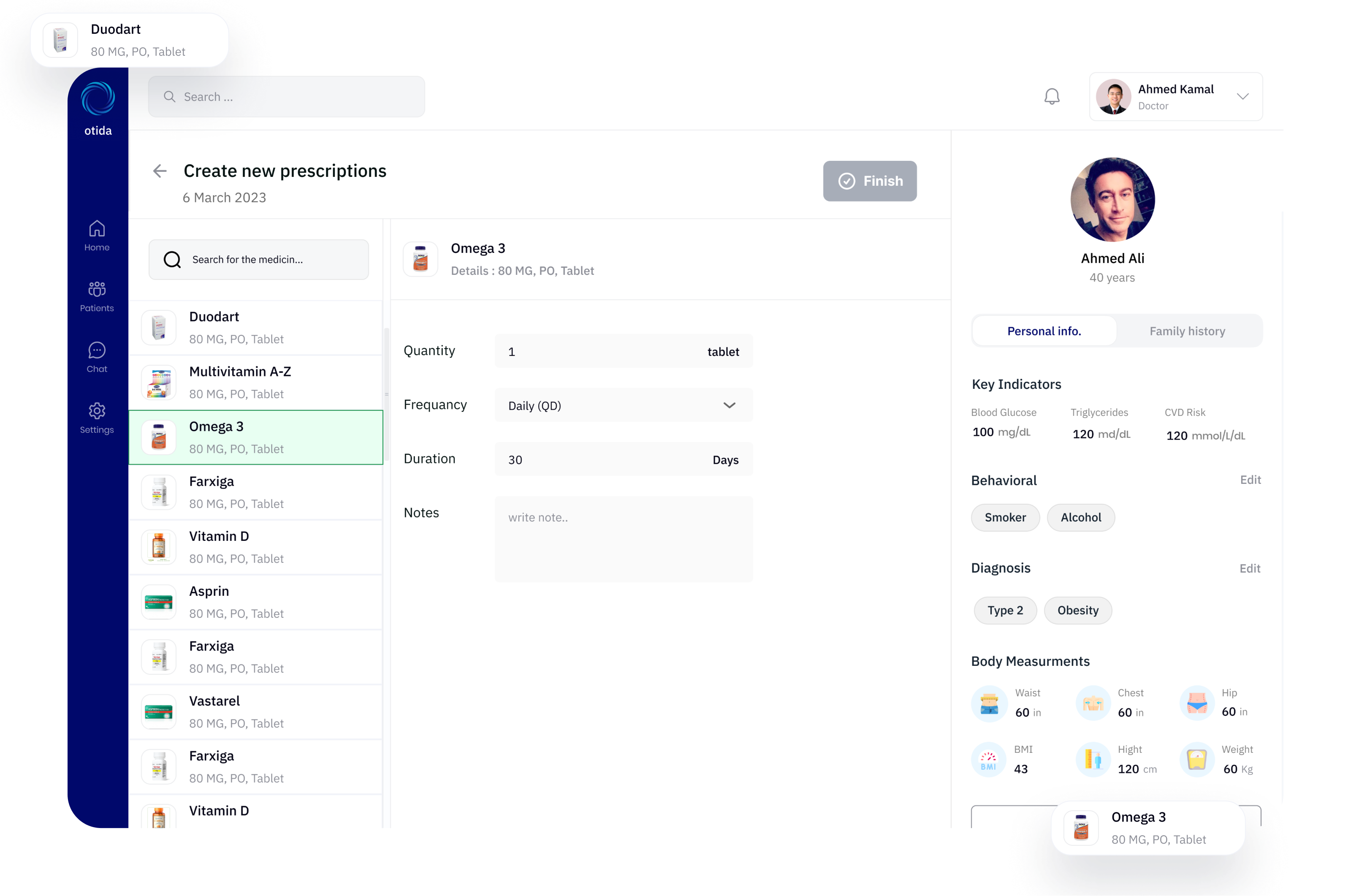
Create a suitable
prescriptions
Prescriptions are written instructions from a licensed healthcare professional, such as a doctor or nurse practitioner, that authorize a patient to obtain a specific medication from a pharmacy to treat a medical condition.
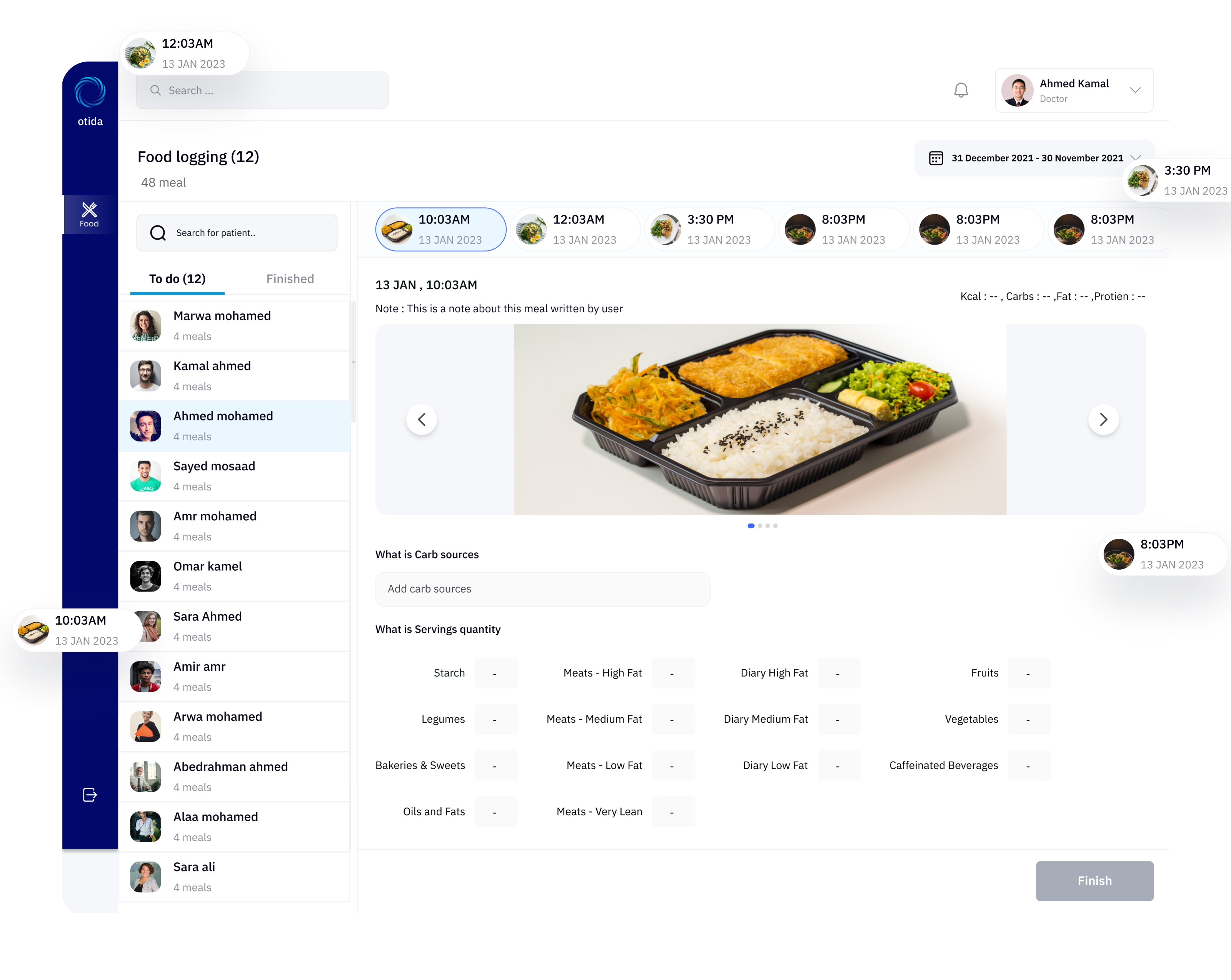
Food logging for
tracking nutritions
Food logging involves recording the types and amounts of foods and beverages consumed by an individual in a food diary or mobile application, which can help monitor calorie and nutrient intake for various health and wellness goals.
Tracking weight changes
and blood glucos
Tracking weight changes involves monitoring an individual's weight over time using a scale or other measurement tool to assess progress toward weight loss or gain goals and identify any potential health concerns.
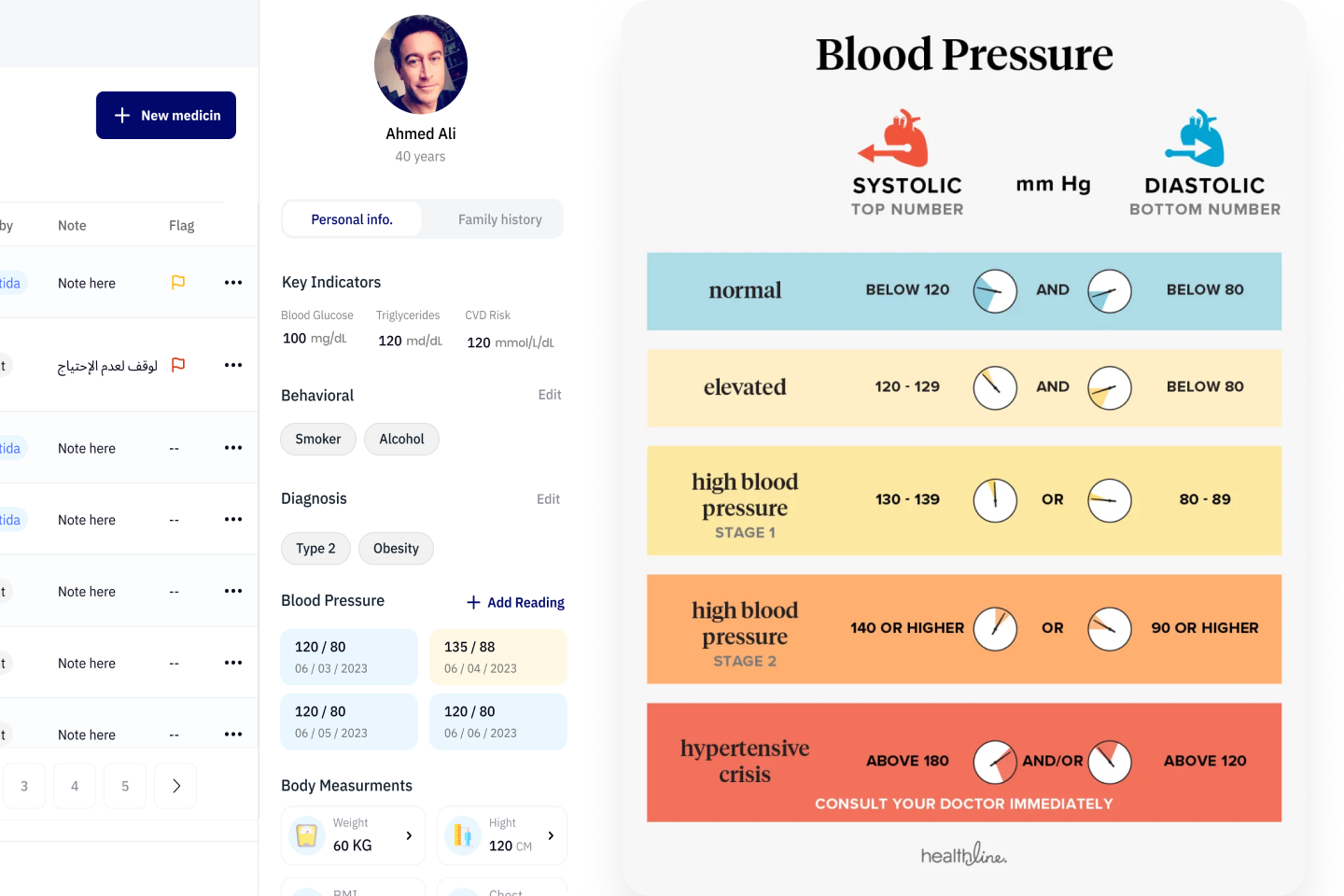
Tracking
Blood Pressure
Tracking blood pressure involves measuring an individual's blood pressure regularly to monitor for changes in blood pressure levels, which can help identify potential health concerns and inform preventive treatment decisions.
Every patient have
a personal plan
We will work with you personally to create your personal plan at an effective and appropriate way for your body and lifestyle. The trainers will show you the right food, how to exercise intensity, and how to tell.
From research
to final UI
The design process followed a structured approach: discovery, definition, interaction design, testing, and iteration. Each phase was informed by the previous one’s findings.
Discovery
Stakeholder interviews and journey mapping to define the decision problem.
Define
Information architecture and key user flows that reduce ambiguity.
Design
Wireframes to high fidelity UI, with interaction patterns for clarity.
Test
Usability testing focused on comprehension, trust, and decision speed.
Iterate
Refine based on findings and technical feasibility constraints.
Results that
validated the work
The new Otida experience aimed to improve comprehension, reduce friction, and increase confidence at key decision moments.
Key takeaways
from the project
Designing Otida highlighted that trust is earned through explanation and reassurance — not just by adding more UI.
Clarity beats complexity
Users will tolerate fewer features if the decision context is explained clearly and consistently.
Comparison is a trust mechanic
When users can compare options quickly, perceived risk drops and confidence increases.
Microcopy reduces cognitive load
Small reassurance messages at the right moments can prevent confusion and abandonment.
Test comprehension, not just preference
Usability sessions should measure whether users understand, not only whether they like the UI.