It all starts with scale to unicorn
In 2017, Halan started as Egypt’s first two- and three-wheeler ride-hailing and delivery app. Since then, Halan has moved into fintech by launching its wallet; bill payments; e-commerce with BNPL; and micro, nano and consumer loans.
Products and surface area expanded year over year (2017–2023).
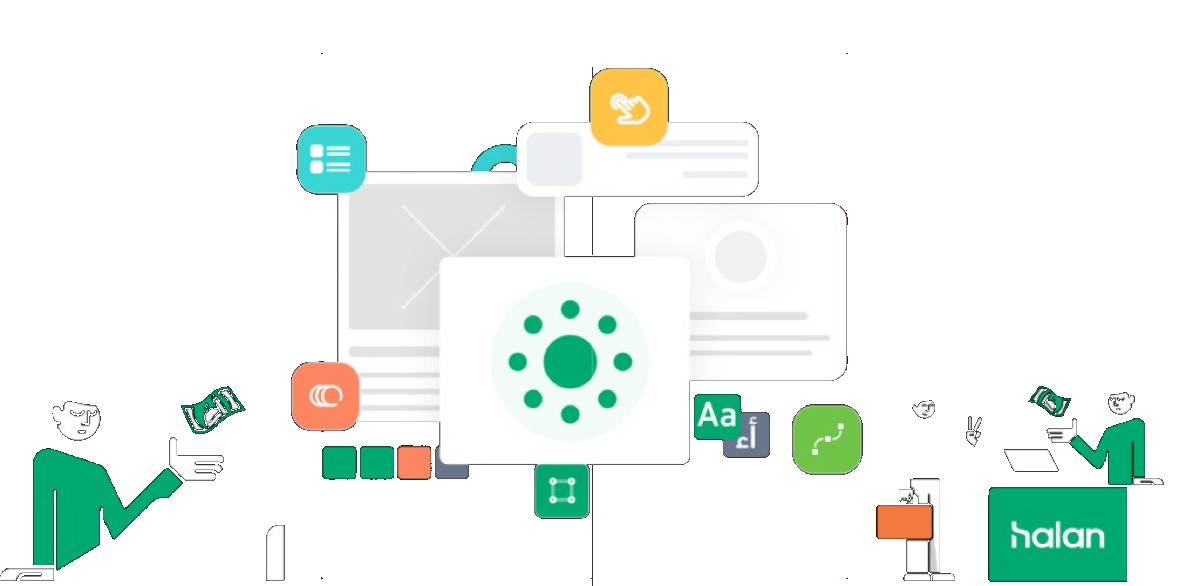
Hero cover
Mint hero with mnt | halan logo, UI collage, and character illustrations.
Pressure at scale
Growing at a rapid rate had repercussions for engineering, operations, marketing, and design teams under pressure to ship quickly and meet user demand. Tight deadlines often left designers struggling to stay aligned and keep work consistent.
It was imperative that we addressed this issue.
Objectives
The main goal was to streamline and accelerate development for a pipeline of new features while keeping a coherent, predictable customer experience across devices.
Consistency in design
Unified brand identity through shared language and components across products and platforms.
Faster development
Less time rebuilding screens by reusing a library of components and guidelines.
Collaboration
Shared language for designers, developers, and stakeholders — clearer decisions and faster alignment.
Polished experience
Interfaces tuned to meet or exceed expectations—more satisfying and enjoyable to use.
Planning to work
We studied the existing system to understand patterns and involved the team for ideas and feedback. It took several iterations to build, improve, and develop — here are major highlights.
We aimed for a modern, intuitive, delightful experience for products across all platforms.
The design system houses guidelines, reusable UI components, templates, and other resources. Let’s see how we got there.
The process
Research
Learning the common standards that represent a successful design system.
Definition
We defined element structure and guides for use.
Design
We designed components and built an organized library.
Taking stock!
To understand the issues, we walked every flow and prioritized identifying problems.
Sifting through three years of Sketch files was not pleasant — but necessary.
When we started, this is what we had 😅
Key findings
As files grew, inconsistencies spread: redundant layers, weak grids, no fixed naming. Some artboards had almost ten “brand” colors — disorganized chaos. Yet patterns emerged: shared colors, typography, and shapes. We needed a system to house and evolve those patterns.
Inconsistency
Colors, components, and guidelines drifted — hurting experience and brand perception.
Redundancy
Without a library, designers repeated work; developers rebuilt components again and again.
Rigidness
Without a system, scaling digital products was harder; a foundation enables consistent, flexible growth.
We started as a team!
As the list of files grew, inconsistencies in design became more prevalent, including redundant hidden layers, lack of grid structures, and no fixed naming conventions. In some cases, we found files with almost ten different “brand” colors in one artboard, highlighting the disorganized chaos. However, amidst this disorder, we began to notice patterns emerging, such as common colors, typography, and shapes forming the foundation of most of our designs. This realization provided hope that all was not lost. What was urgently needed was a system to house and develop these patterns over time, allowing for greater design consistency and efficiency.
Getting buy-in
We aligned stakeholders before building — so the system would stick.
Use the design system?
Users of a design system typically include:
Designers
Primary owners of components and guidelines — creating and maintaining what the system is built from.
Engineers
Ongoing implementation and updates — keeping the system relevant as products evolve.
Marketing teams
Campaigns and channels stay on-brand when they share the same design language.
Pick a development mule
We chose a product with the widest range of use cases to stress-test the system — Halan-Lending — so we could anticipate issues early.
On Halan-Lending we saw recurring patterns, documented components, and started a style guide for the redesign. A style guide alone only gets you so far.
Share the learnings
After the style guide, we involved Halan-Mart, Halan-PAY, and Loan officer — rolling out one product at a time because Halan is huge and we were still learning the language.
- Shipping one language across the whole platform would have been a long, risky blast radius.
- Step-by-step rollouts helped each team trust the system would hold up.
Designs from new Halan-PAY — four months to reach that point.
Using the same components from Halan-PAY, we produced HALAN-MART designs in four weeks.
Results spread beyond immediate teams — engineers, designers, PMs, and leadership started talking in components, not screens.
Improve results
Outcomes followed adoption: faster delivery, fewer crashes, and more stable code as components were refactored repeatedly.
Number design system serves
Design system contains
Charts
Monthly change rates for components and tokens (Jan–Dec).
The scope
The system spans 66 sections, organized by components, families, and houses.
Design principles
Our principles reflect our philosophy — how digital experiences unlock potential in any team.
Spread awareness
Customers often don’t know banking terms. Educate in everyday language (Egyptian Arabic preferred). Learning curve is steep — this overrides other rules when needed.
Keep it consistent
Consistency is expensive to earn — keep patterns stable, but not at the cost of education.
Be obvious
Don’t make users hunt — make intent clear.
See through their eyes
Use familiar cues, check contrast, and adapt font sizes for comfort.
How we’re working
Our system follows Brad Frost’s Atomic Design — modular UI construction for scalable reuse.
Foundation
A well-designed system helps teams hit design and development goals and improve UX across products.
Color tokens mapping
Foundation / Main
| Name | Hex | Token |
|---|---|---|
| Halan Primary | #00A870 | $foundation-main-halan-primary |
| Halan Secondary | #000000 | $foundation-main-halan-secondary |
| White | #FFFFFF | $foundation-main-white |
Foundation / Accent (status)
| Name | Hex | Token |
|---|---|---|
| Positive-regular | #00A870 | $foundation-accent-positive-regular |
| Warning-regular | #FFC100 | $foundation-accent-warning-regular |
| Pending-regular | #F37E47 | $foundation-accent-pending-regular |
| Danger-regular | #E83E58 | $foundation-accent-danger-regular |
| Glass-regular | #38C4C1 | $foundation-accent-glass-regular |
| Purple-regular | #A22B93 | $foundation-accent-purple-regular |
Core / App / Background / Main
| Name | Hex | Token |
|---|---|---|
| Default | #F9FAF9 | $core-app-background-default |
| Halan-light | #EFFBF4 | $core-app-background-halan-light |
| Disabled | #F1F1F1 | $core-app-background-disabled |
| Transparent overlay | #545B5A | $core-app-background-transparent-overlay |
Core / App / Background / Accent
| Name | Hex | Token |
|---|---|---|
| Warning-light | #FFF8E1 | $core-app-background-accent-warning-light |
| Pending-light | #FDE9E1 | $core-app-background-accent-pending-light |
| Danger-light | #FFE9ED | $core-app-background-accent-danger-light |
| Positive-light | #E6F6F1 | $core-app-background-accent-positive-light |
| Purple-light | #F7E9F4 | $core-app-background-accent-purple-light |
| Turquoise-light | #EBF9F9 | $core-app-background-accent-turquoise-light |
Core / App / Content
| Name | Hex | Token |
|---|---|---|
| Primary | #1C211F | $core-app-content-primary |
| Secondary | #545B5A | $core-app-content-secondary |
| Tertiary | #BDBDBD | $core-app-content-tertiary |
| Quaternary | #E0E0E0 | $core-app-content-quaternary |
| Disabled | #9E9E9E | $core-app-content-disabled |
Core / App / Border
| Name | Hex | Token |
|---|---|---|
| Default | #F2F2F2 | $core-app-border-default |
| Scanner | #FAFAFA | $core-app-border-scanner |
| Disabled | #F5F5F5 | $core-app-border-disabled |
Typography & families
Latin: Inter · Arabic: Deen Next Display (دين نيكست)
Spacing scale
hs-space-none— 0pxhs-space-xxs— 4pxhs-space-xs— 8pxhs-space-sm— 12pxhs-space-md— 16pxhs-space-lg— 24pxhs-space-xl— 32pxhs-space-2xl— 48pxhs-space-3xl— 64px
Alternate naming: ha-space-xxs (4px) through ha-space-xxl (64px) in documentation.
Iconography & illustrations
Icons represent actions and objects; illustrations simplify complex ideas and reflect context and emotion.
Illustration can: make ideas accessible; express brand; scale with context; tune tone; support storytelling — not as decoration.