Etar
Design System
The largest RTL-first design system for Figma — 4,000+ components and variants supporting Arabic and English, built for web and mobile at scale.
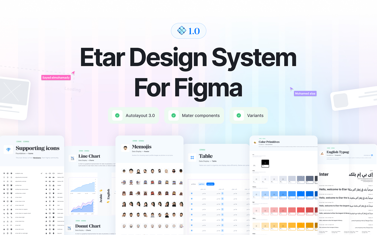
A collaborative system built for the Arab world
Etar is a collaborative project between me and Mohamed Alaa. Together we set out to build the most comprehensive RTL design system for Figma — drawing from experience shipping design systems at Halan, the first fintech unicorn in Africa.
The largest design system supporting RTL languages
Etar is the largest design system supporting RTL languages for both web pages and mobile applications. It helps teams start any project faster, save thousands of hours, and raise the overall quality of design — with global styles and precision-crafted components for both Arabic and English interfaces.
Six pain points every RTL designer faces
Designers face compounding problems when building interfaces for RTL languages — problems that existing design systems completely ignore.
Inconsistency
Time-consuming process
Brand standards drift
Poor scalability
Communication gaps
RTL completely ignored
Text alignment, layout mirroring, navigation direction, visual hierarchy — all must be reconsidered for Arabic, Hebrew, and Persian. Without a system, this multiplies design and dev effort by 2x.
A Figma UI kit with RTL built in
4,000+ Figma components with Arabic and English on one property—layouts mirror for RTL instead of rebuilding screens.
One system, every brand
Building a one-size-fits-all design system that fits into any product workflow, any brand guideline, and any team — while remaining immediately understandable without documentation.
Gaps we found in existing UI kits
We audited the most popular Figma UI kits to map unmet needs and identify Etar's unique position.
Messy organization
No clear ordering across pages.
Meaningless grouping
Vague labels with no usage guidance.
Desktop-only thinking
Mobile variants are limited or missing.
Opaque naming
Cryptic props — you need docs to guess what they do.
Too basic
Buttons and inputs only — no charts, tables, or complex patterns.
Zero RTL support
1.8B Arabic, Hebrew & Persian speakers — no native kit.
4,000+ components & variants
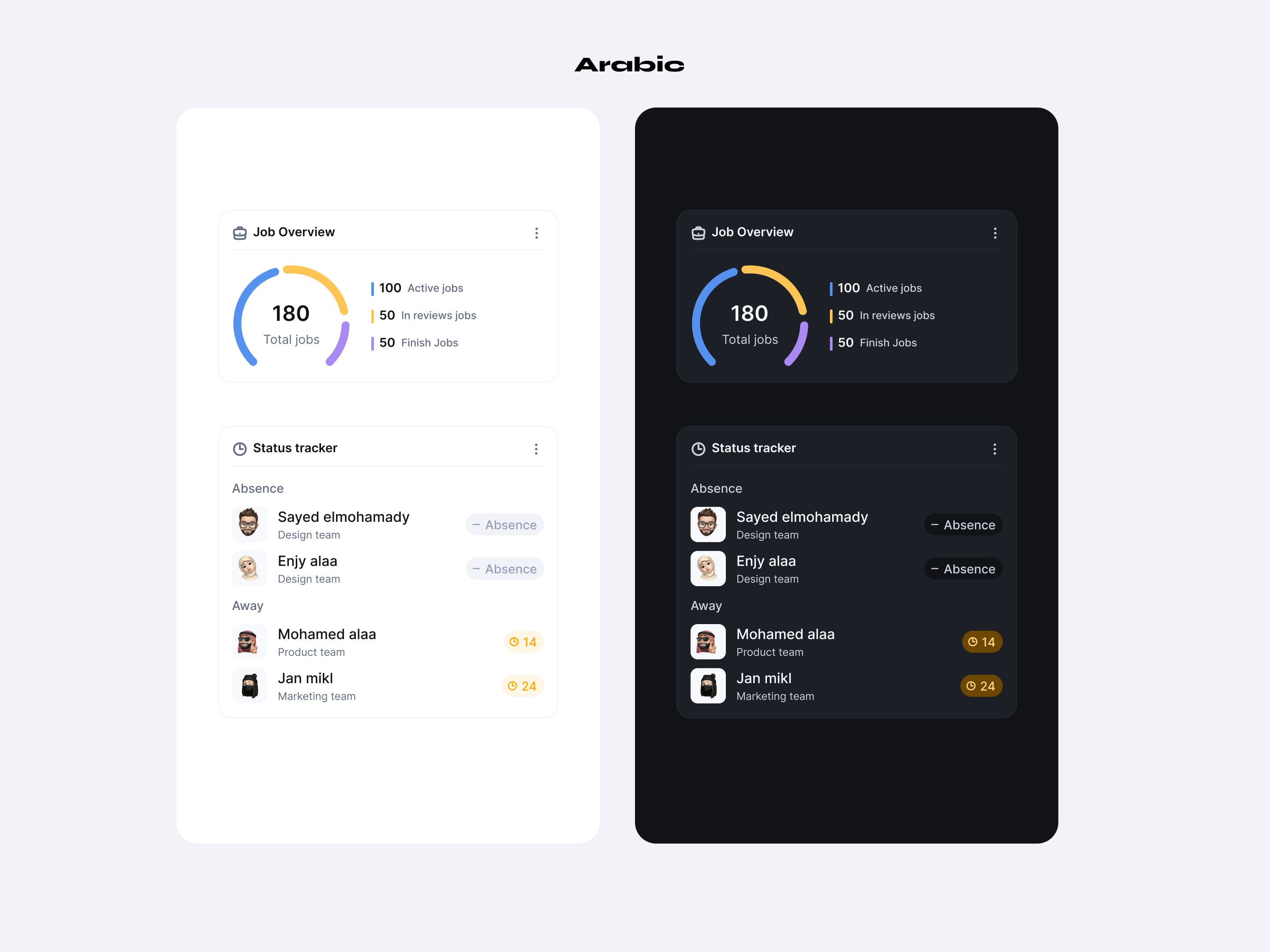
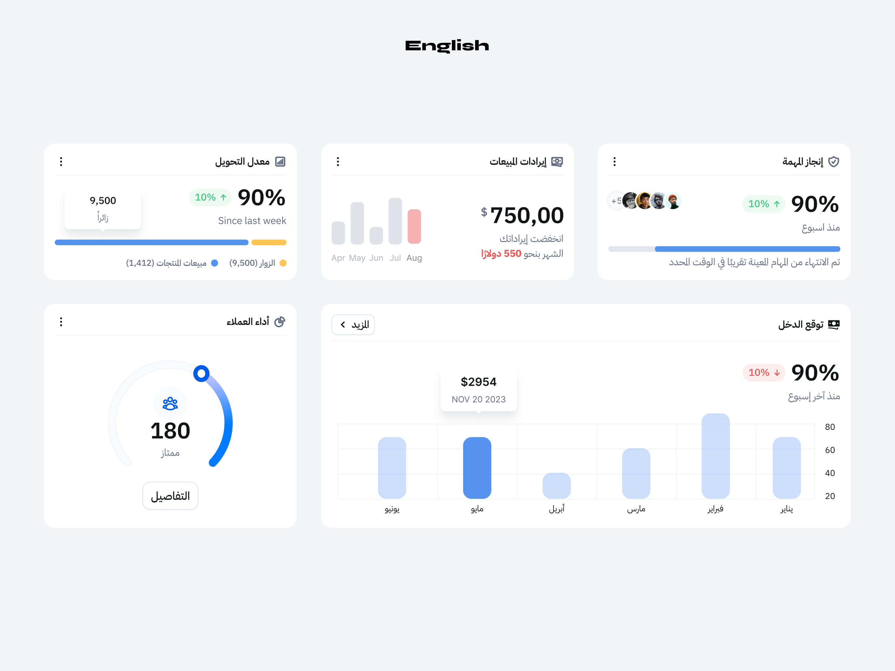
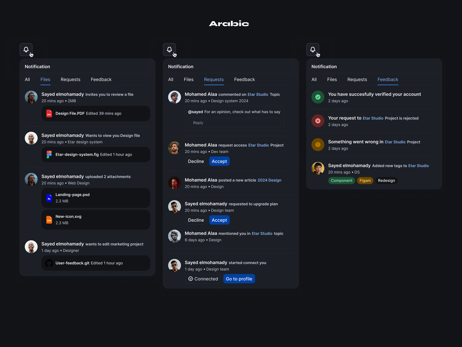
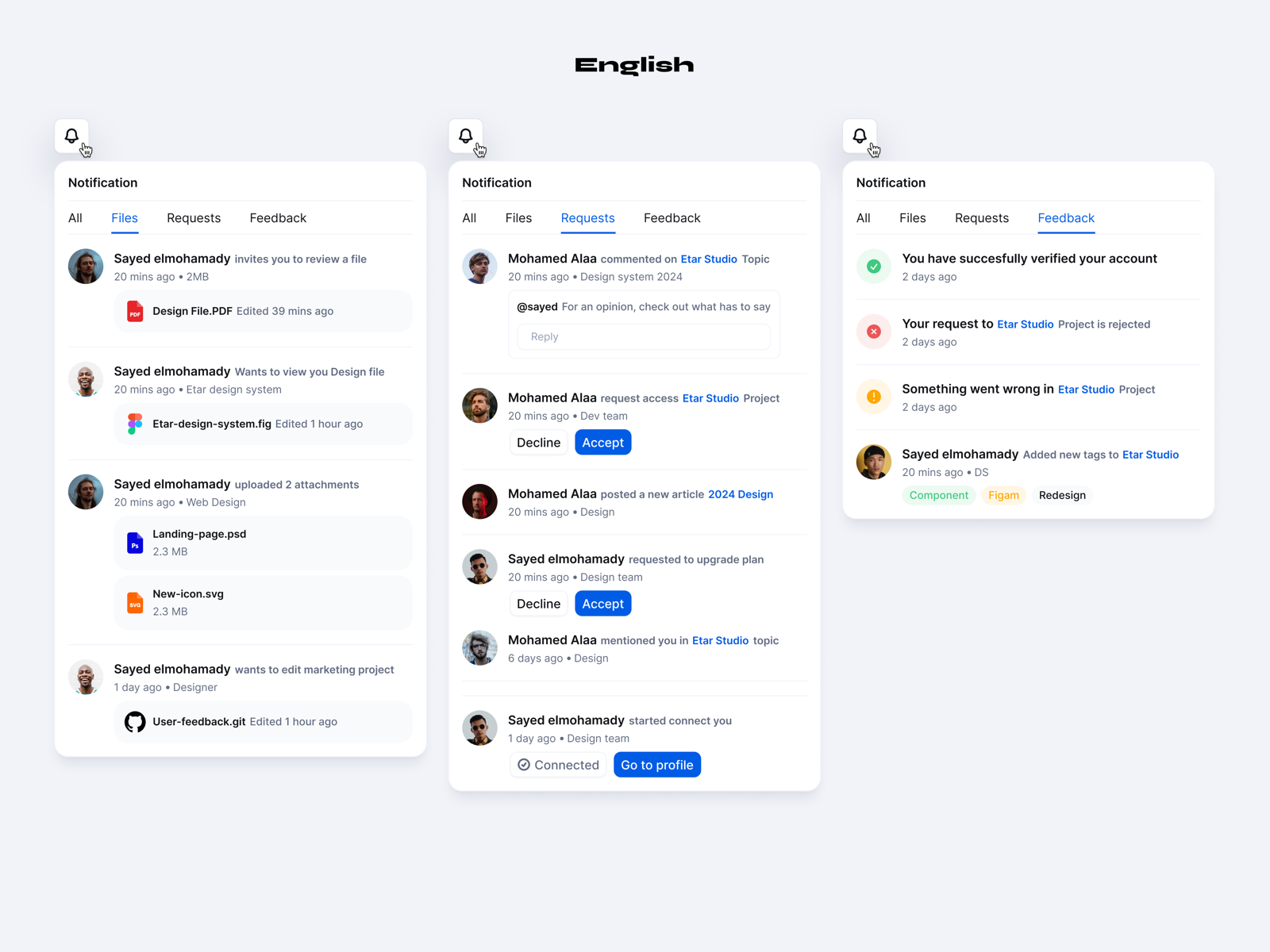
Etar consists of more than 4,000 well-designed components and variants supporting RTL languages across mobile and web — accelerating the design process by eliminating from-scratch work while maintaining consistency at scale.

Grouped by purpose, not category
Groups answer when you reach for a component—not only what it is.
Actions
5 components · 1,050 variantsButtons
Primary through icon—every state, web and mobile.
Item Button
List rows with icon, label, and trailing actions.
Hyperlink & More
Links, groups, dock nav—full action set.
Navigation
5 components · 454 variantsApp Bar & Tab Bar
Top and bottom app chrome—RTL mirrored.
Page Header
Breadcrumbs, actions, search—web layouts.
Tabs & Stepper
Tabs, steps, pagination, side nav.
Data Entry
6 components · 389 variantsInput Field
Text, selects, dates—with validation states.
Search & Filter
Search fields and list controls, multiple modes.
Slider & Keypad
Sliders, upload, numeric keypad for mobile.
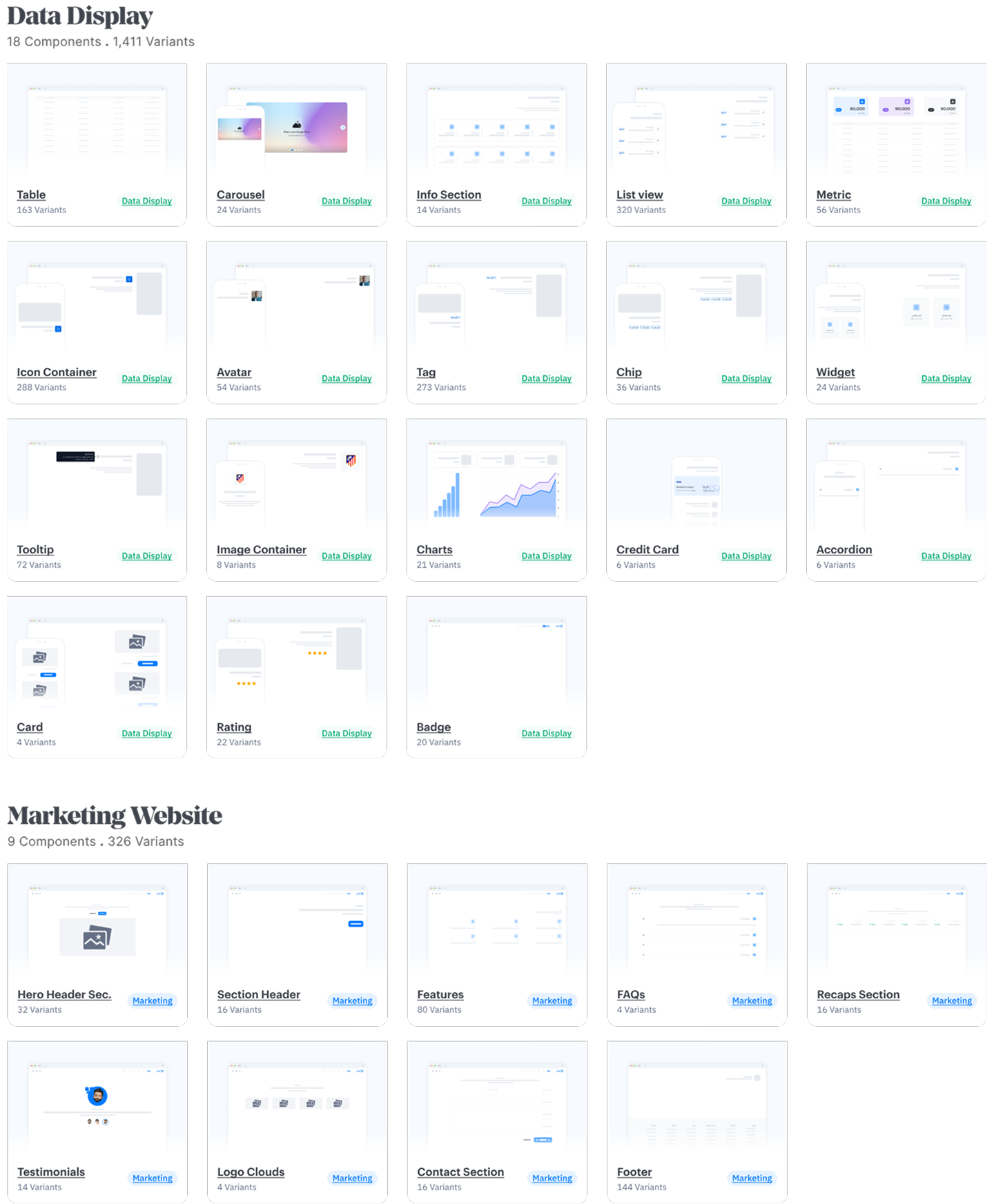
Data Display
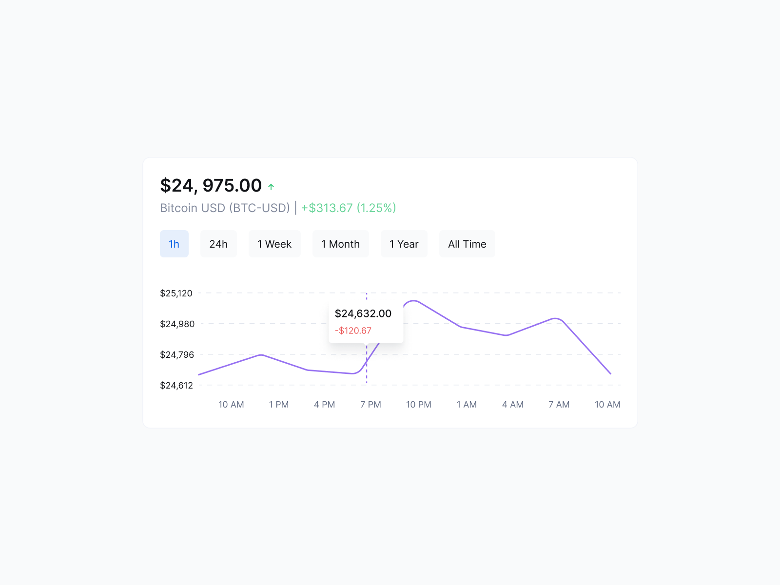
18 components · 1,411 variantsTables & Charts
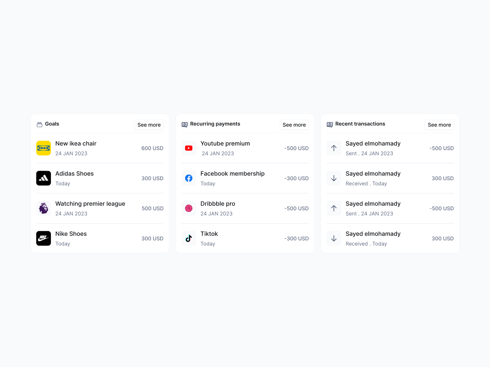
Tables, line and donut charts, carousels.
Cards & Lists
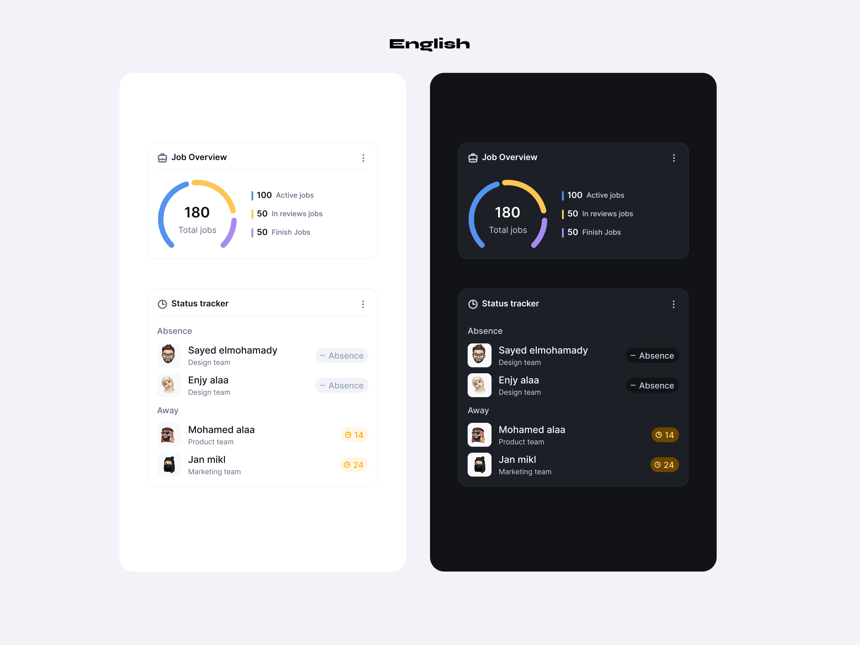
Lists, cards, avatars, tags, chips, badges.
Widgets & Tooltips
Tooltips, widgets, accordion, ratings, media.
Feedback
6 components · 261 variantsDialogue & Drawer
Modals, sheets, drawers for decisions.
Alerts & Snackbars
Inline alerts and toasts—all severities.
Progress & Loaders
Progress, spinners, skeletons for loading UI.
Marketing Website
9 components · 326 variantsHero & Headers
Heroes and section heads—marketing + bilingual.
Features & FAQs
Feature blocks, FAQs, recap, testimonials.
Logo Clouds & Footer
Logo strips, contact blocks, footers.
Bidirectional by default
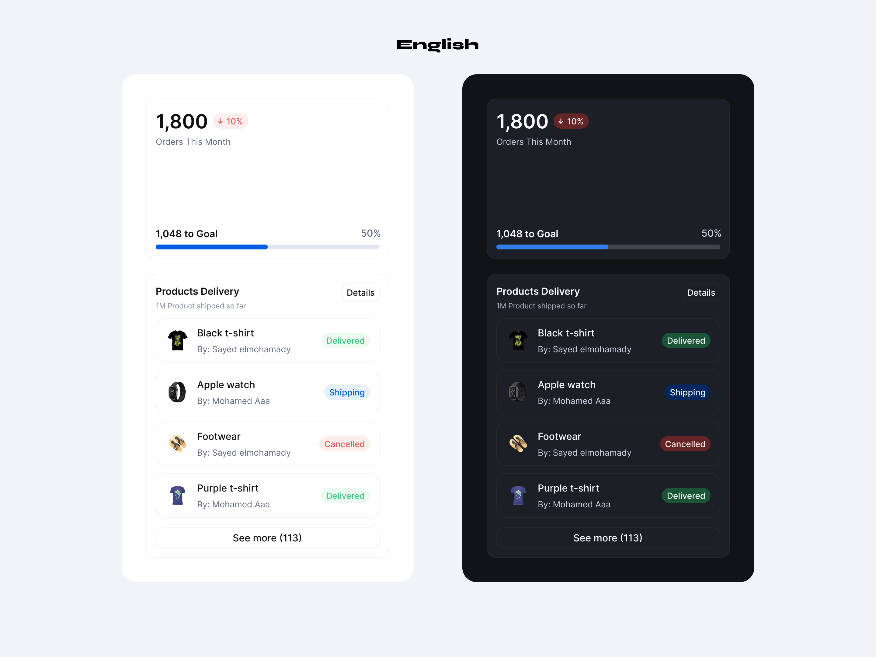
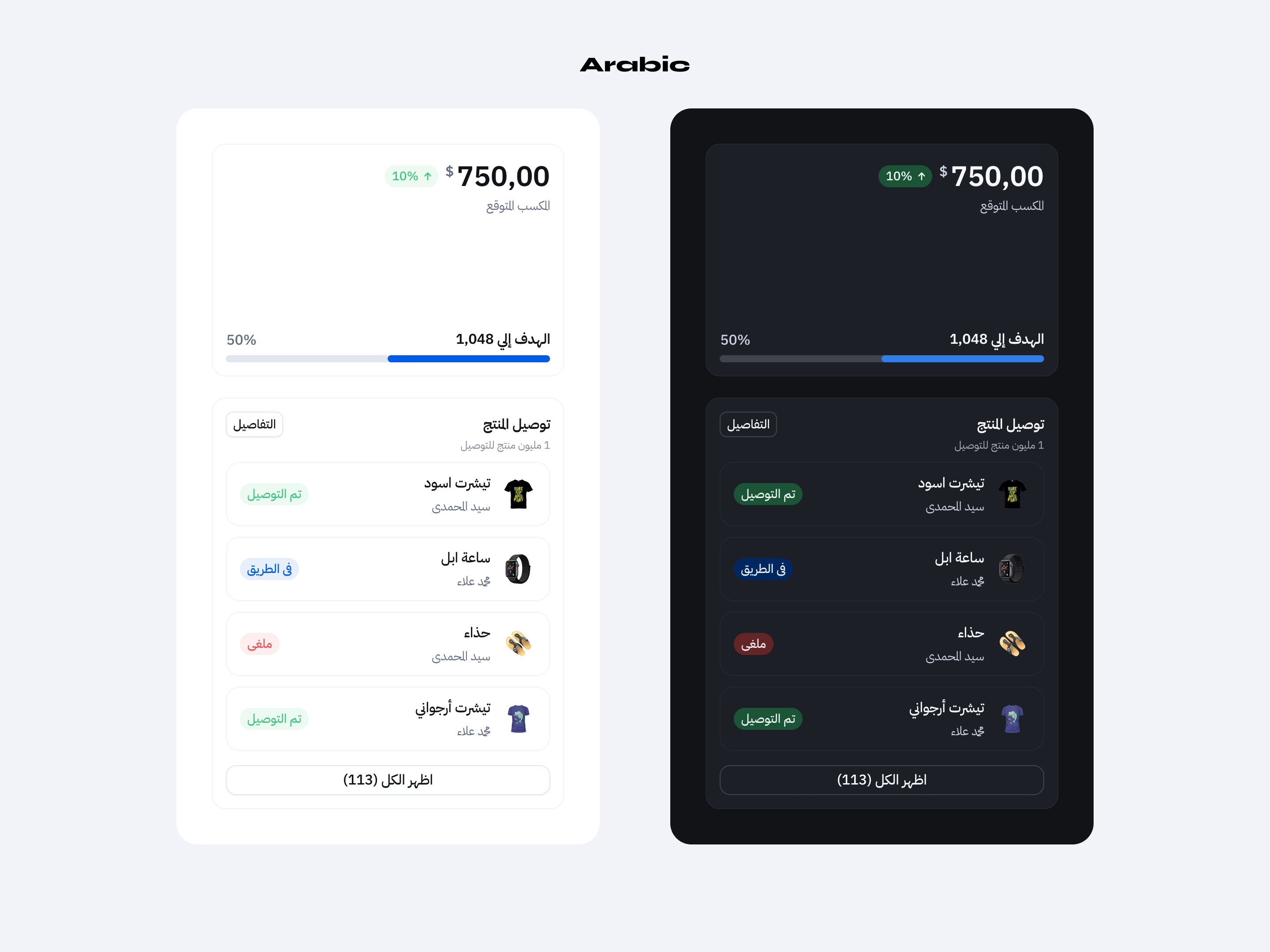
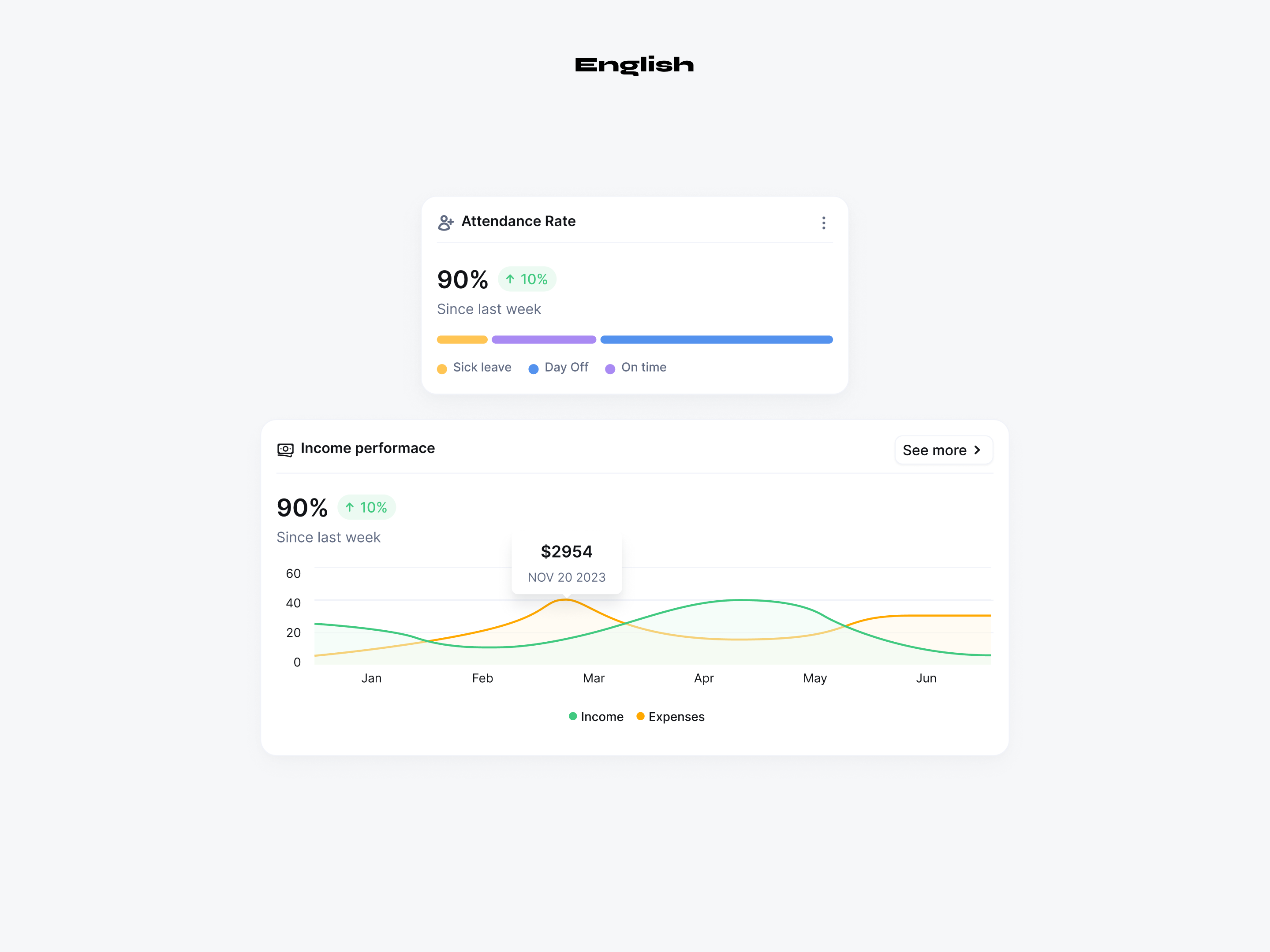
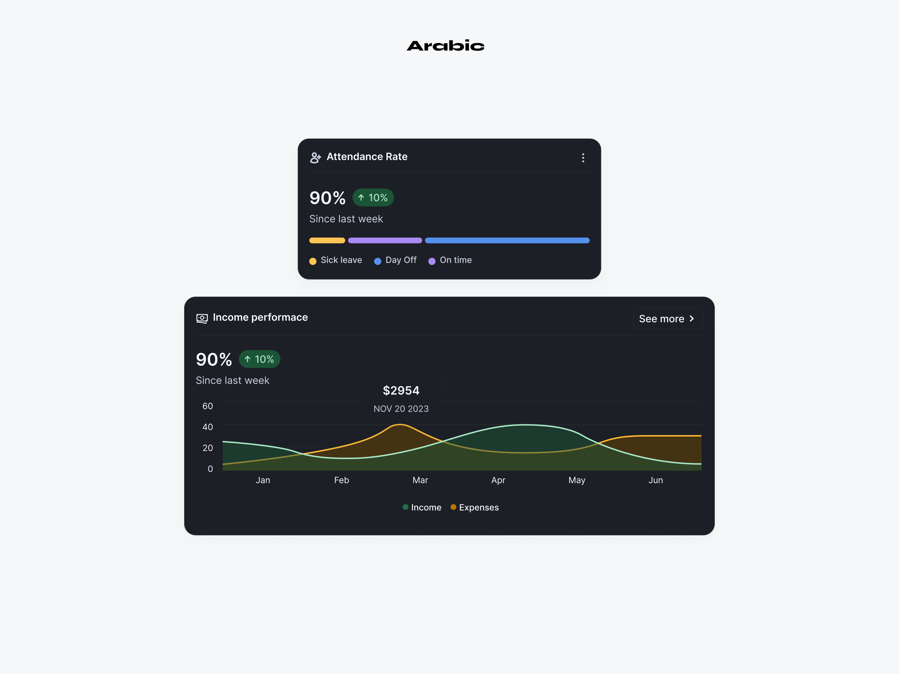
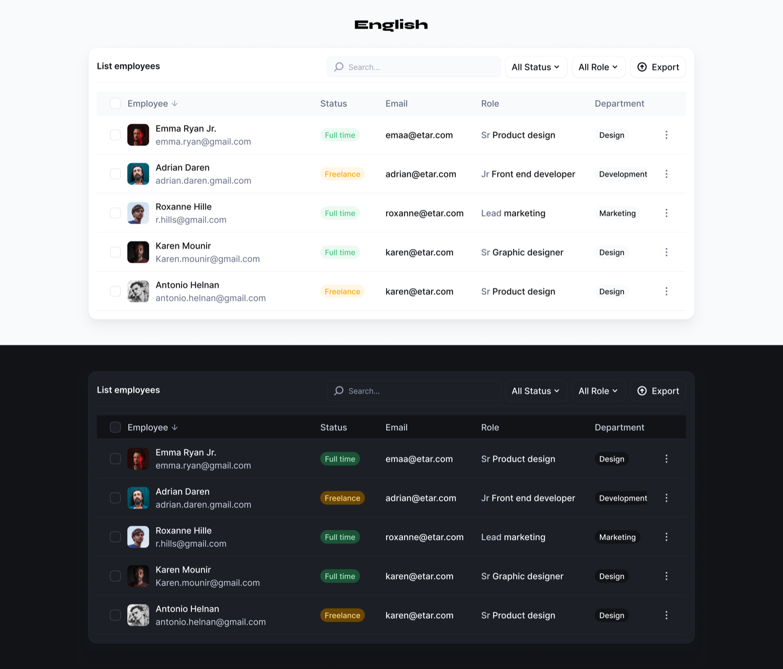
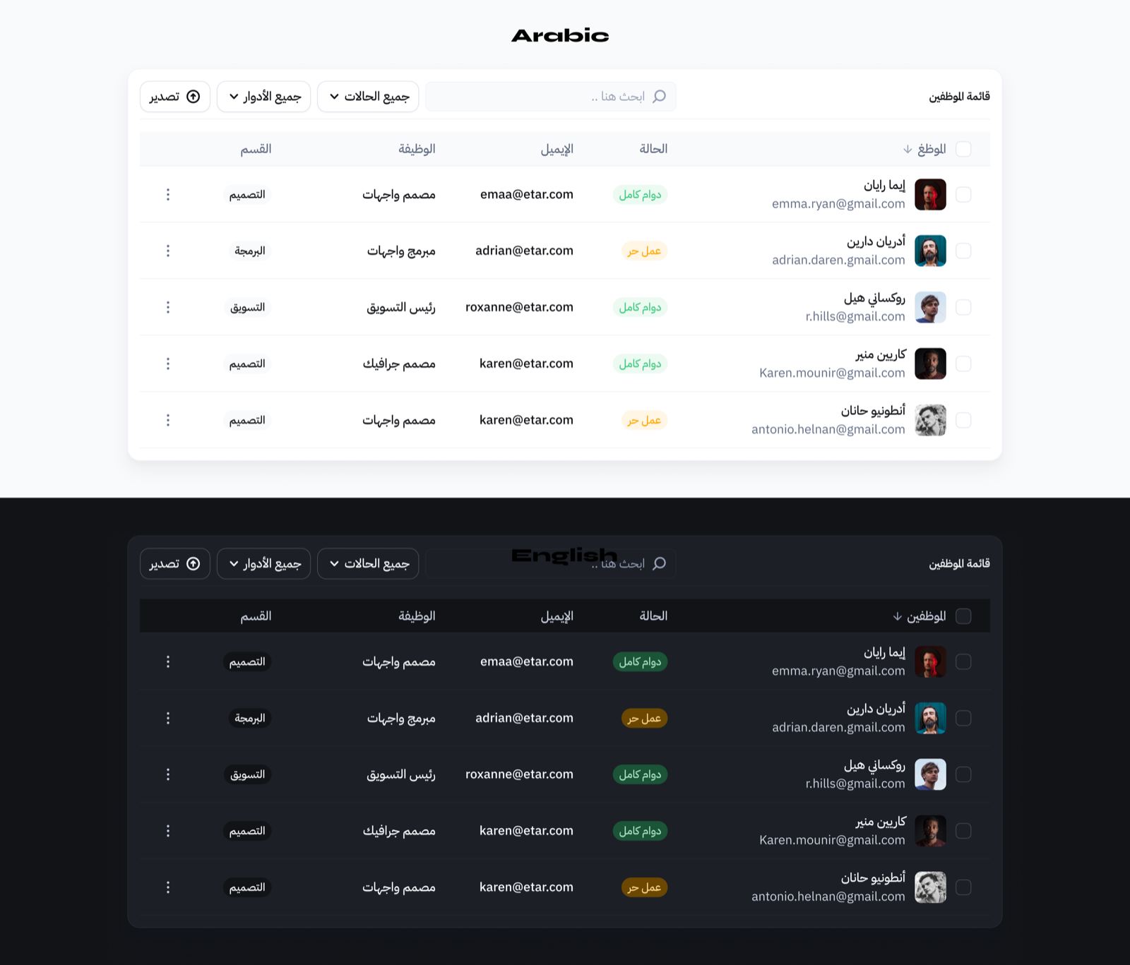
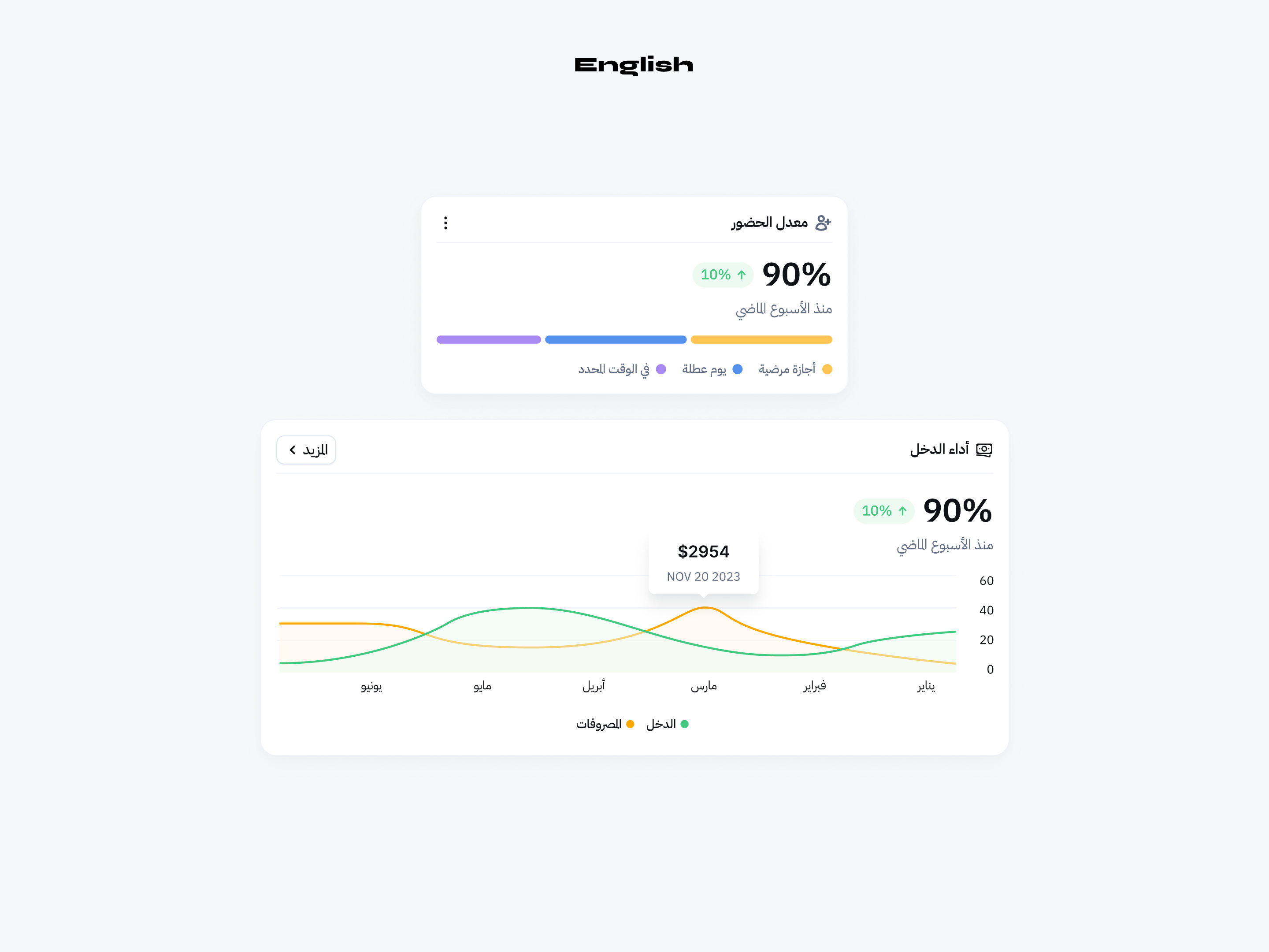
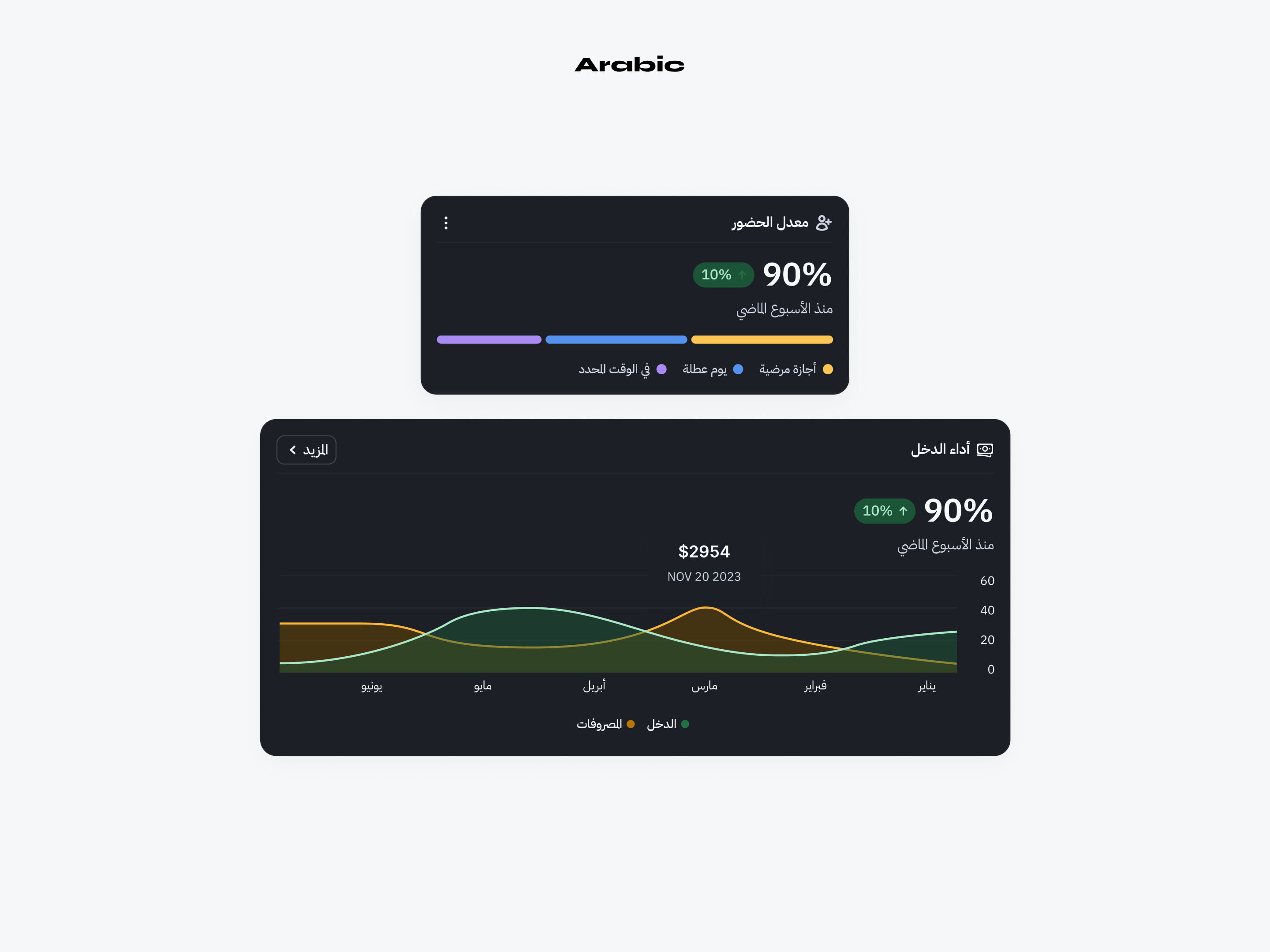
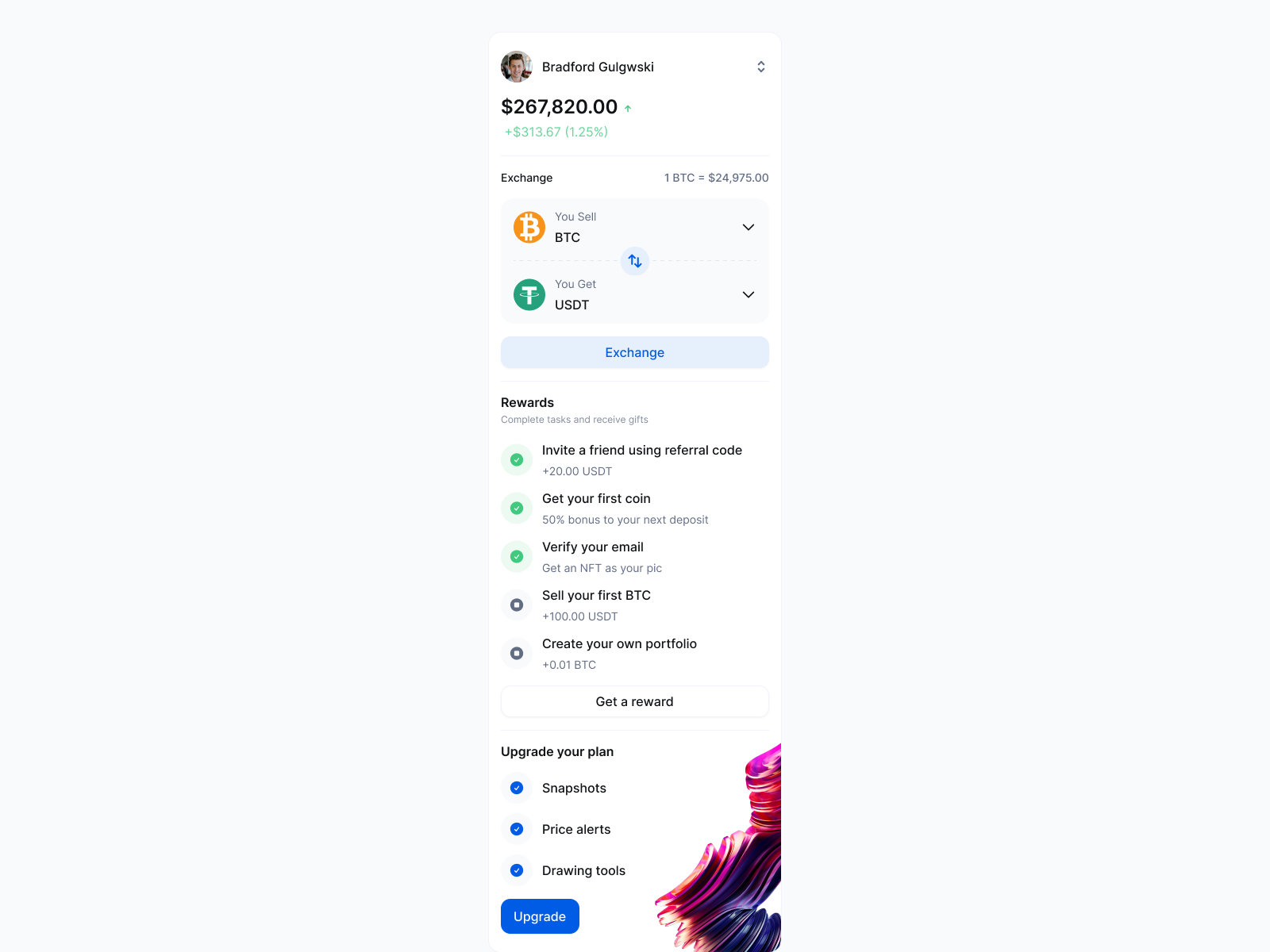
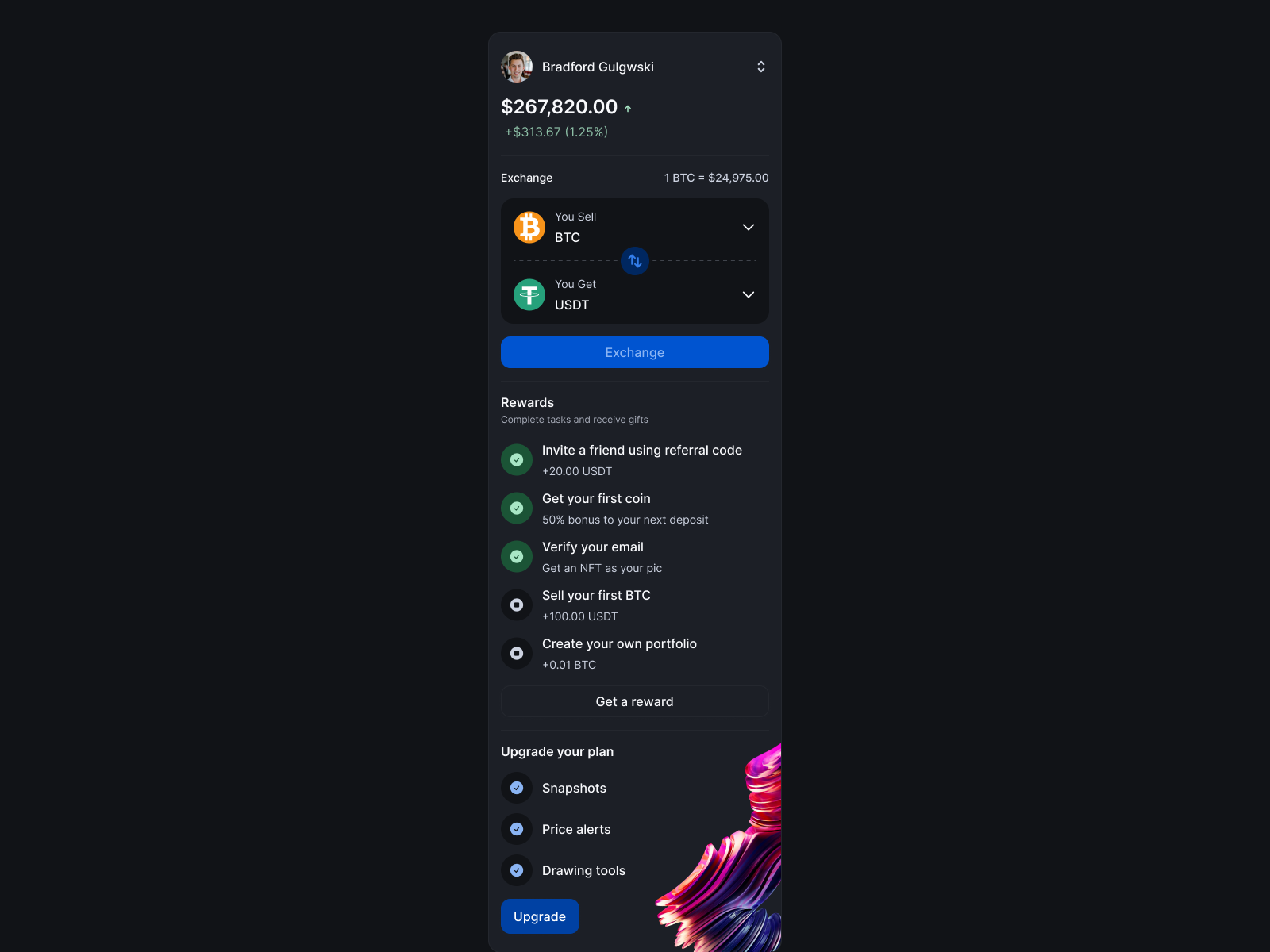
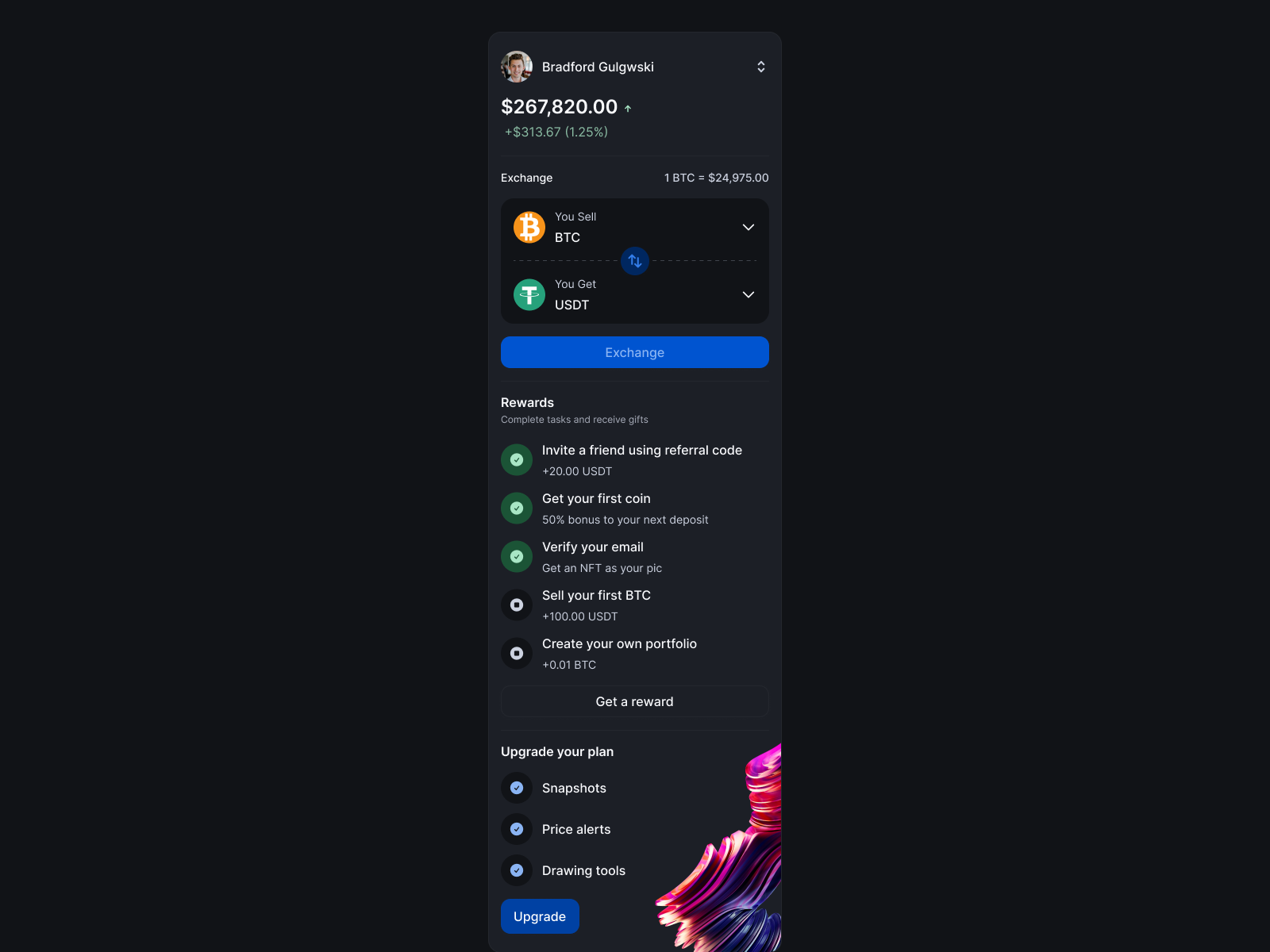
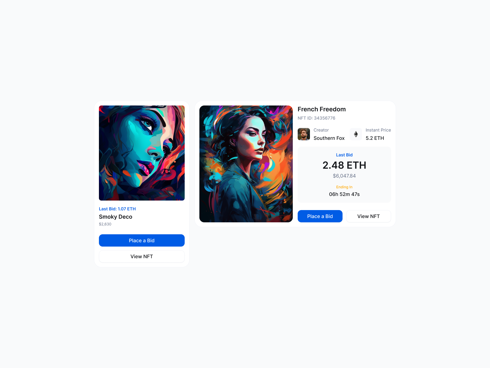
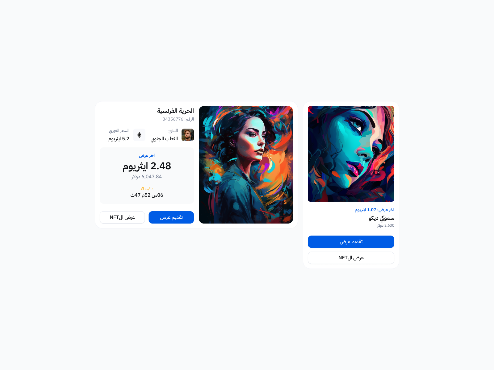
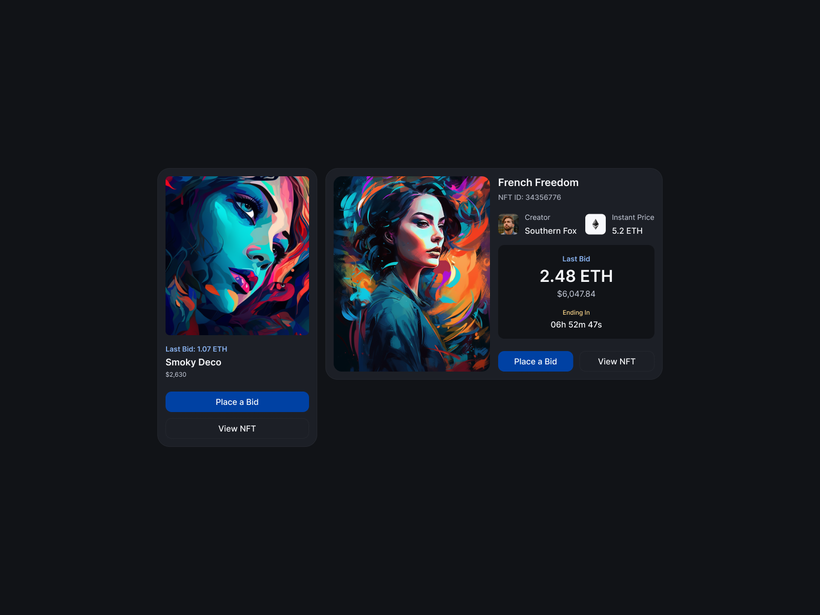
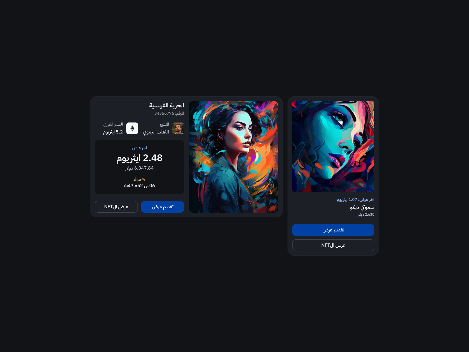
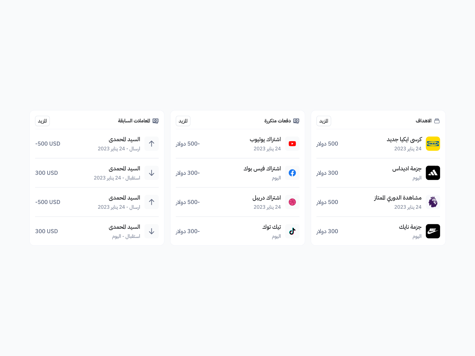
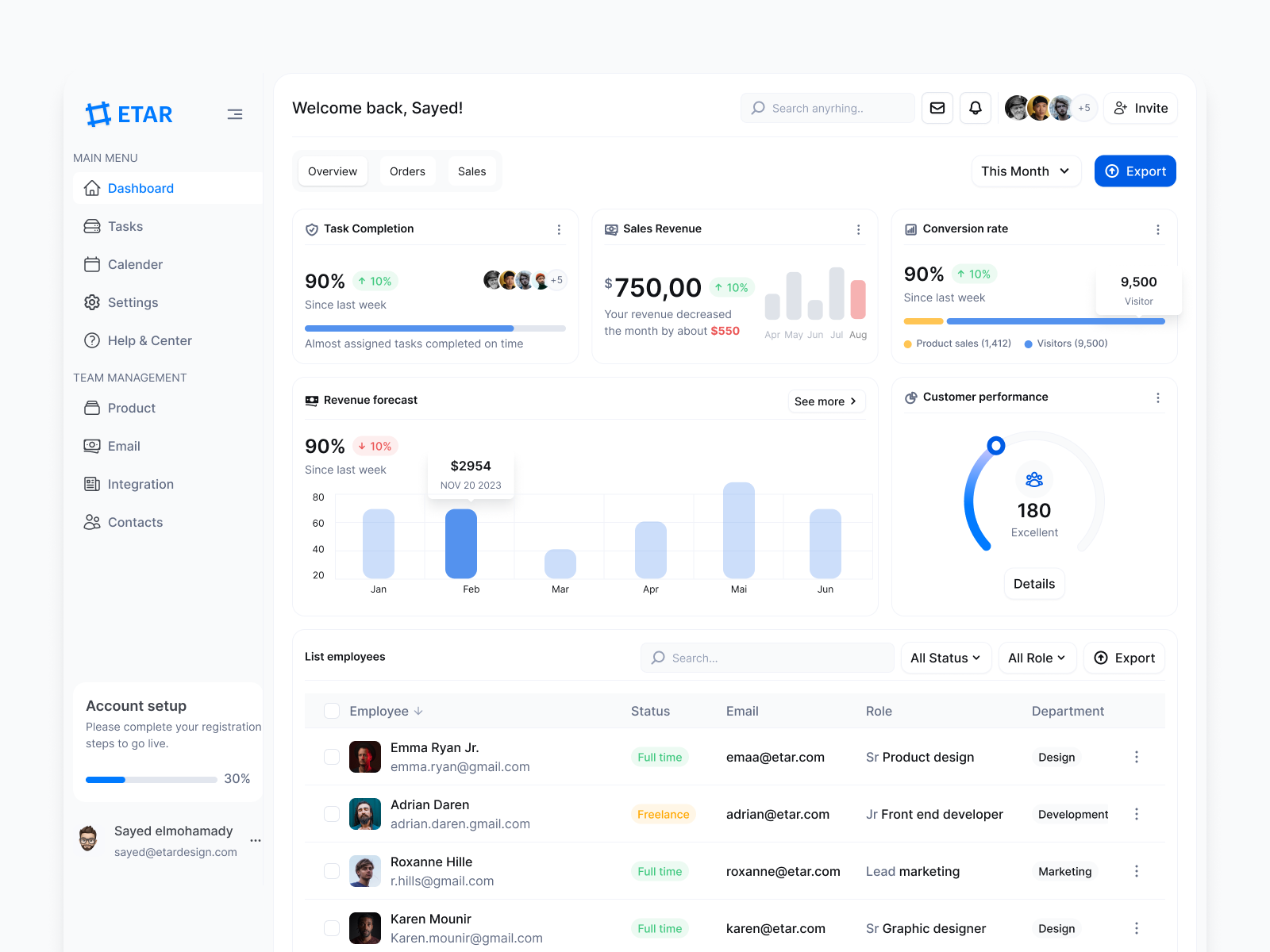
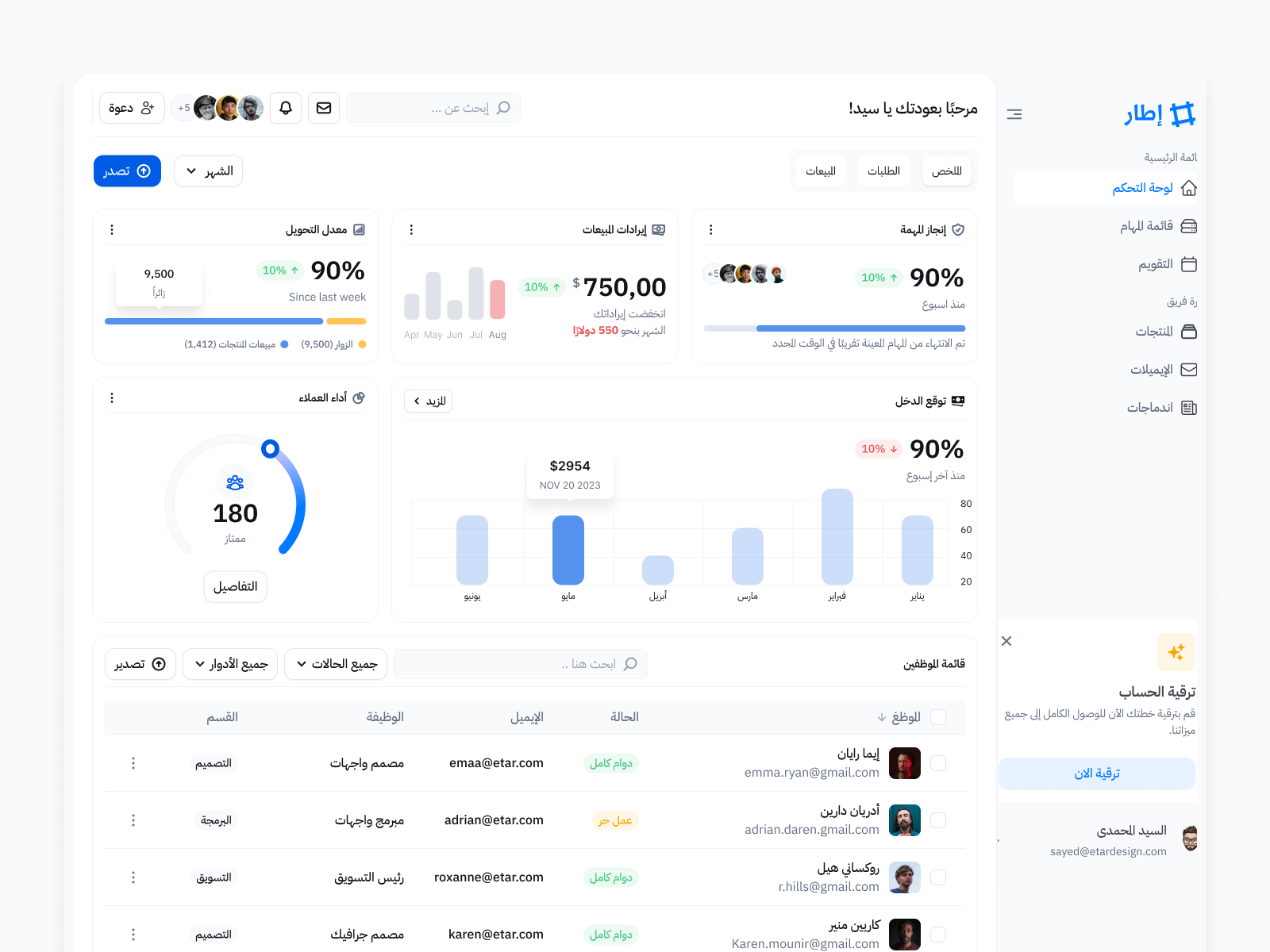
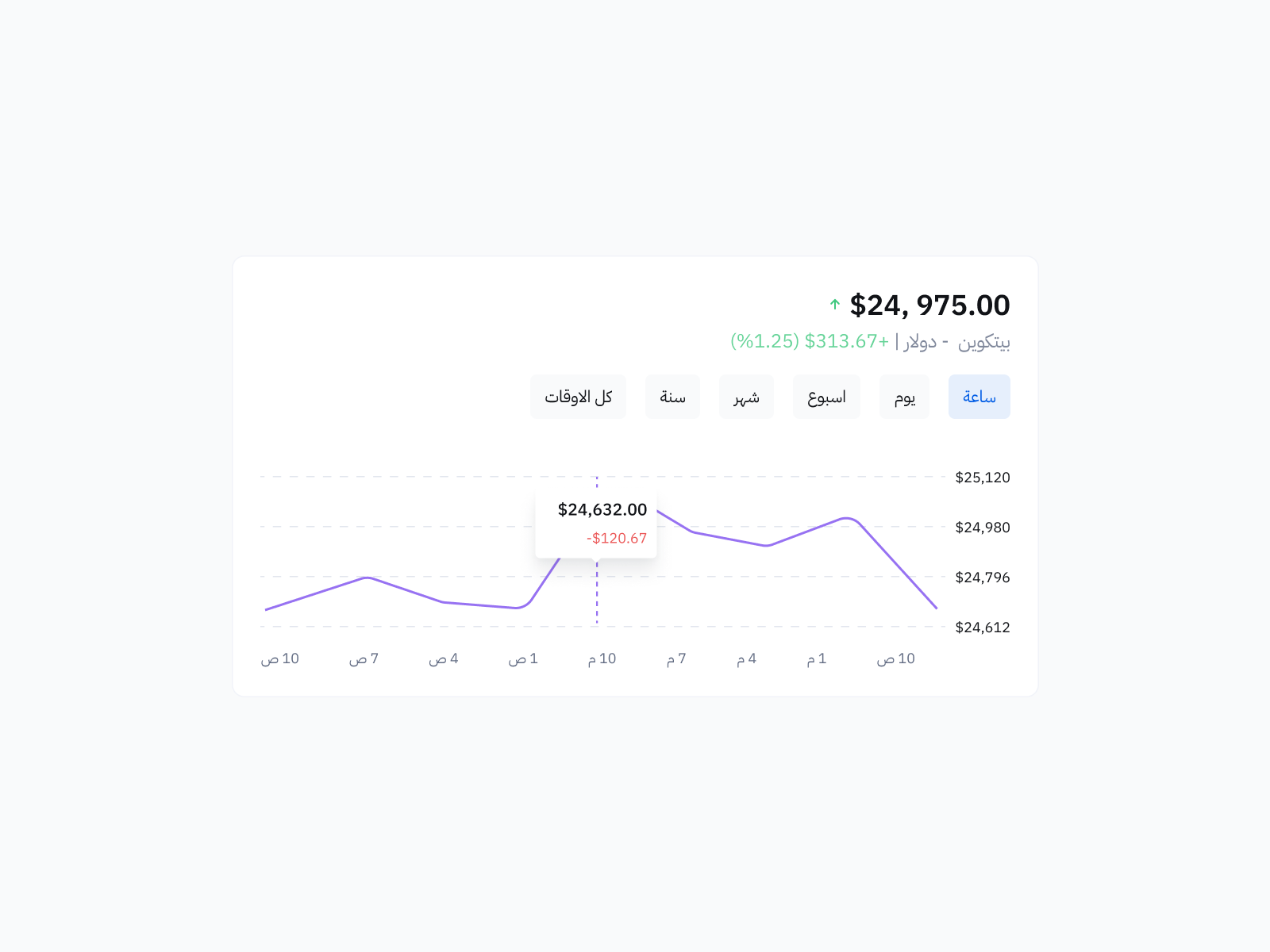
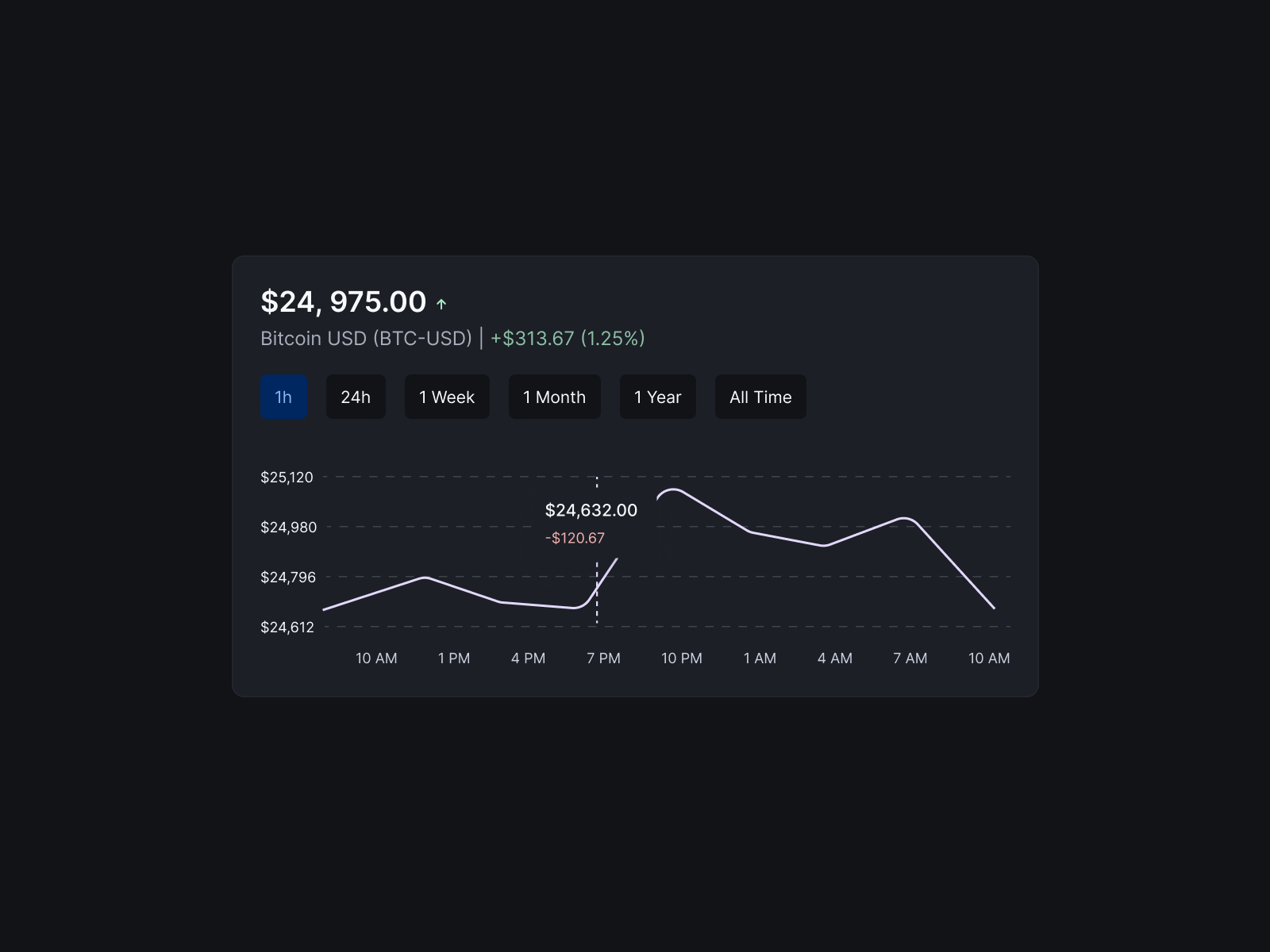
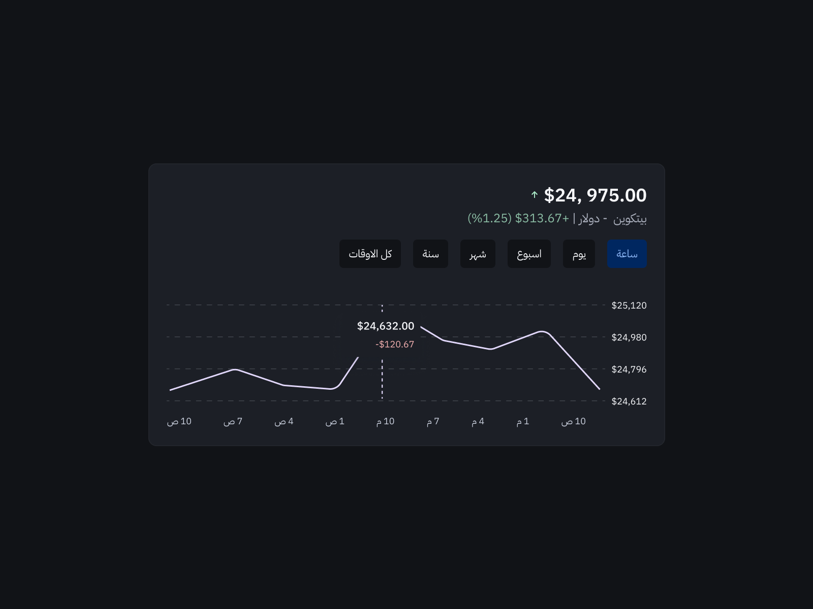
Components switch from English (LTR) to Arabic (RTL) via a single property toggle. Auto-layout directions mirror automatically. Text layer names stay consistent so inserted text is never lost when switching direction.
Clear Properties Naming
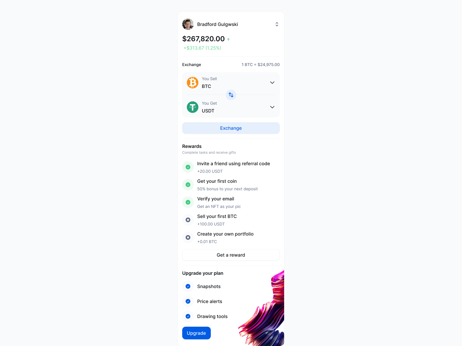
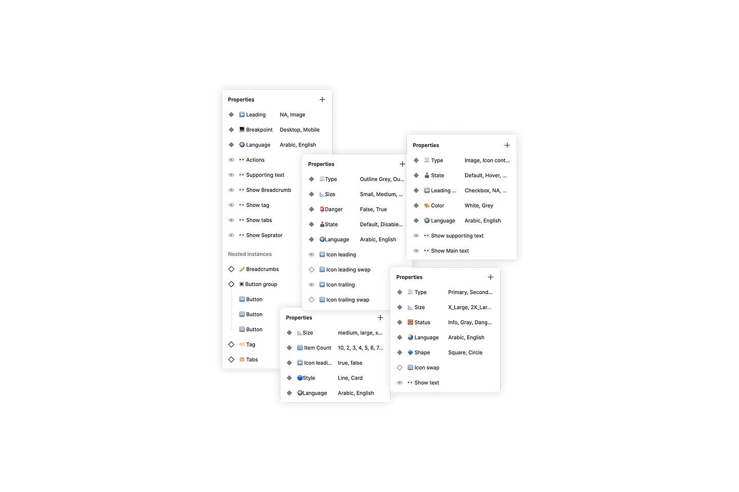
Every property name in Etar is descriptive enough to use without documentation. Emojis add a layer of visual delight and help designers quickly scan and identify what each property controls.
Every component ships with both LTR and RTL. One property toggles direction globally — no manual mirroring, no extra work.
- Auto-layout direction switching
- Consistent text layer names
- Icon and image mirroring
- Cultural typography support
The most comprehensive RTL design system available on Figma Community — covering every surface from mobile app to marketing website.
- 49 component groups
- 6 semantic categories
- Web & mobile coverage
- Global styles & tokens