
01 / Overview
A loyalty platform that feels like a game — and performs like one
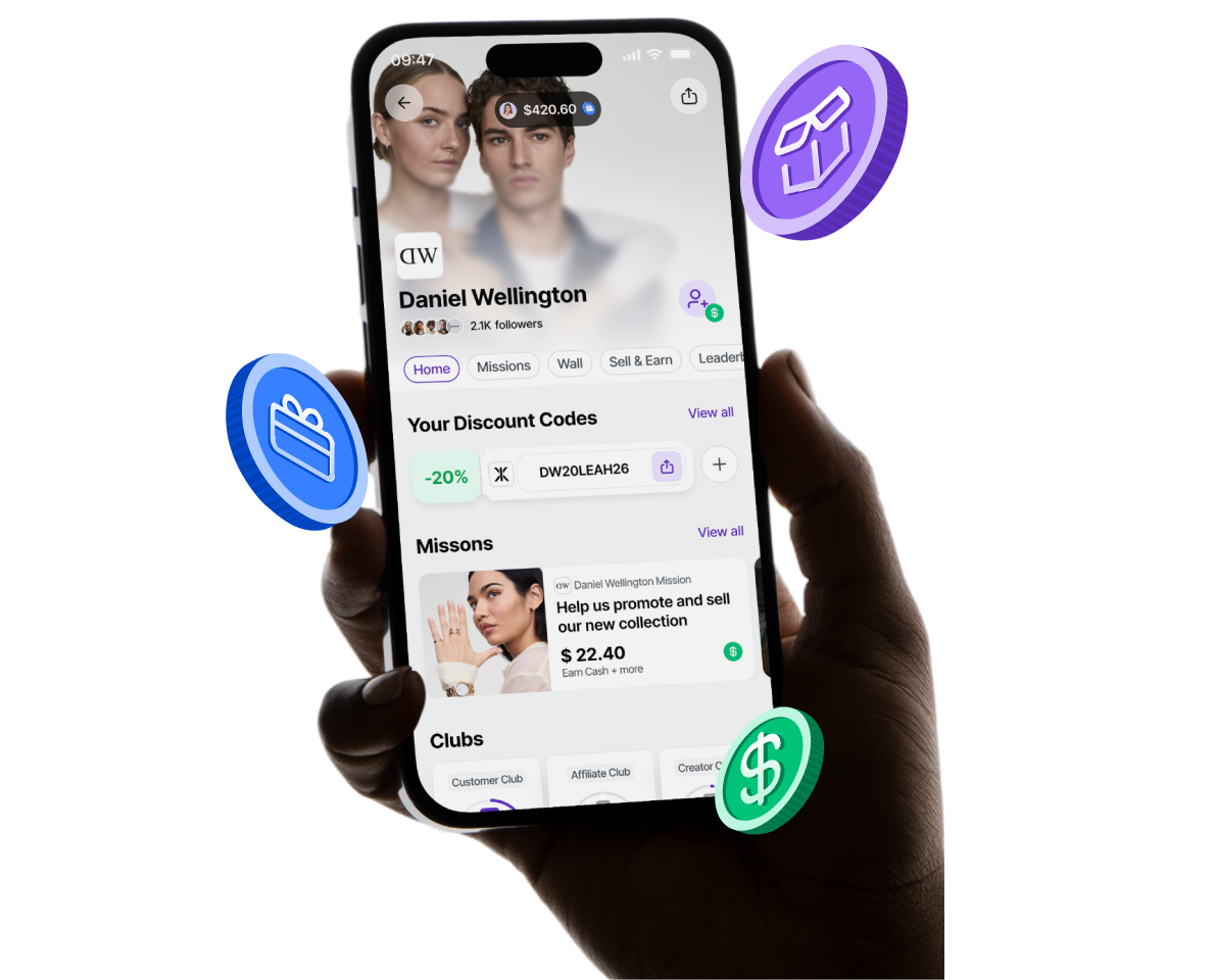
Club App is a brand loyalty and ambassador platform where users join goal-based communities called Clubs, complete behavior-driven Missions, earn Coins, and compete on Leaderboards. Every action is meaningful. Every reward is earned. Every brand gets measurable engagement.
As the Senior Product Designer, I owned the end-to-end UX of the core gamification engine: from the initial concept and system architecture through user flows, interaction design, and final UI delivery.
02 / Problem Space
Points-based loyalty programs accumulate quietly in the background. Users forget they exist. Brands collect data but gain no advocacy. The disconnect between action and reward is too long, too abstract, and emotionally empty.
Passive Participation
Users earn points automatically without any meaningful effort or intention. There's no sense of achievement — just accumulation.
No Emotional Connection
Transactional systems reward spending, not belonging. Users feel no attachment to the brand or community around it.
Poor Data for Brands
Swipe-and-earn models generate transactional data, but brands can't identify advocates, understand intent, or trigger behavioral actions.
Low Re-engagement
Without progression systems or social mechanics, users churn after their first redemption. There's nothing pulling them back.
Users don't want to be rewarded for spending — they want to earn recognition for who they are as fans.
Core insight from 24 user interviews and competitive loyalty audit, Q2 2023
Traditional vs. Gamified
- Passive points accumulation
- Anonymous, transactional
- Delayed, abstract rewards
- No social layer or community
- One-size-fits-all program
- No behavioral triggers for brands
- Active missions with clear intent
- Named identity, ranked standing
- Instant coin rewards + visible progress
- Club community + leaderboard competition
- Brand-specific goals and tiers
- Real-time Klaviyo event integration
03 / Gamification System
The core loop: Action → Reward → Progress → Recognition → Repeat
Every gamification system lives or dies by its loop. We designed Club App's loop to be tight, emotionally satisfying, and driven by real-world brand behaviors — not arbitrary point farming.
User completes a brand-defined mission — a purchase, a social share, a review, a referral. Real behaviors, real stakes.
→Coins drop instantly. The amount, rarity, and animation vary by mission type — making every reward feel earned and distinct.
→Club level advances. Mission streaks build. The user sees exactly how close they are to the next tier, the next reward, the next recognition.
→Leaderboard ranking updates. Badges unlock. The community sees who's leading. Social visibility makes achievement meaningful beyond the self.
Five pillars of the system
Clubs
Goal-based communities owned by brands. Users opt in, join a purpose, and belong to something larger than a purchase history.
Missions
Discrete, completable tasks tied to brand KPIs. Each mission has a clear action, a coin reward, and an expiry — creating urgency.
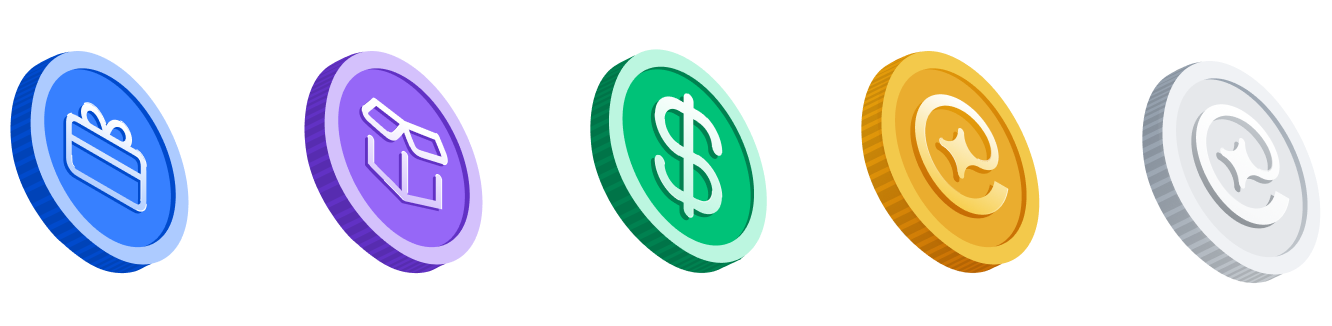
Coins
The universal in-platform currency. Earned through missions and Club-level bonuses. Spent on cash-back, gift cards, or branded rewards.
Leaderboards
Per-Club rankings that reset monthly. Competitive visibility drives re-engagement. Top performers unlock exclusive rewards and brand recognition.
Levels
Five-tier progression inside each Club: Newcomer → Member → Regular → Champion → Ambassador. Each level unlocks new mission types and exclusive perks.
04 / System Architecture
From user action to integration — the full event pipeline
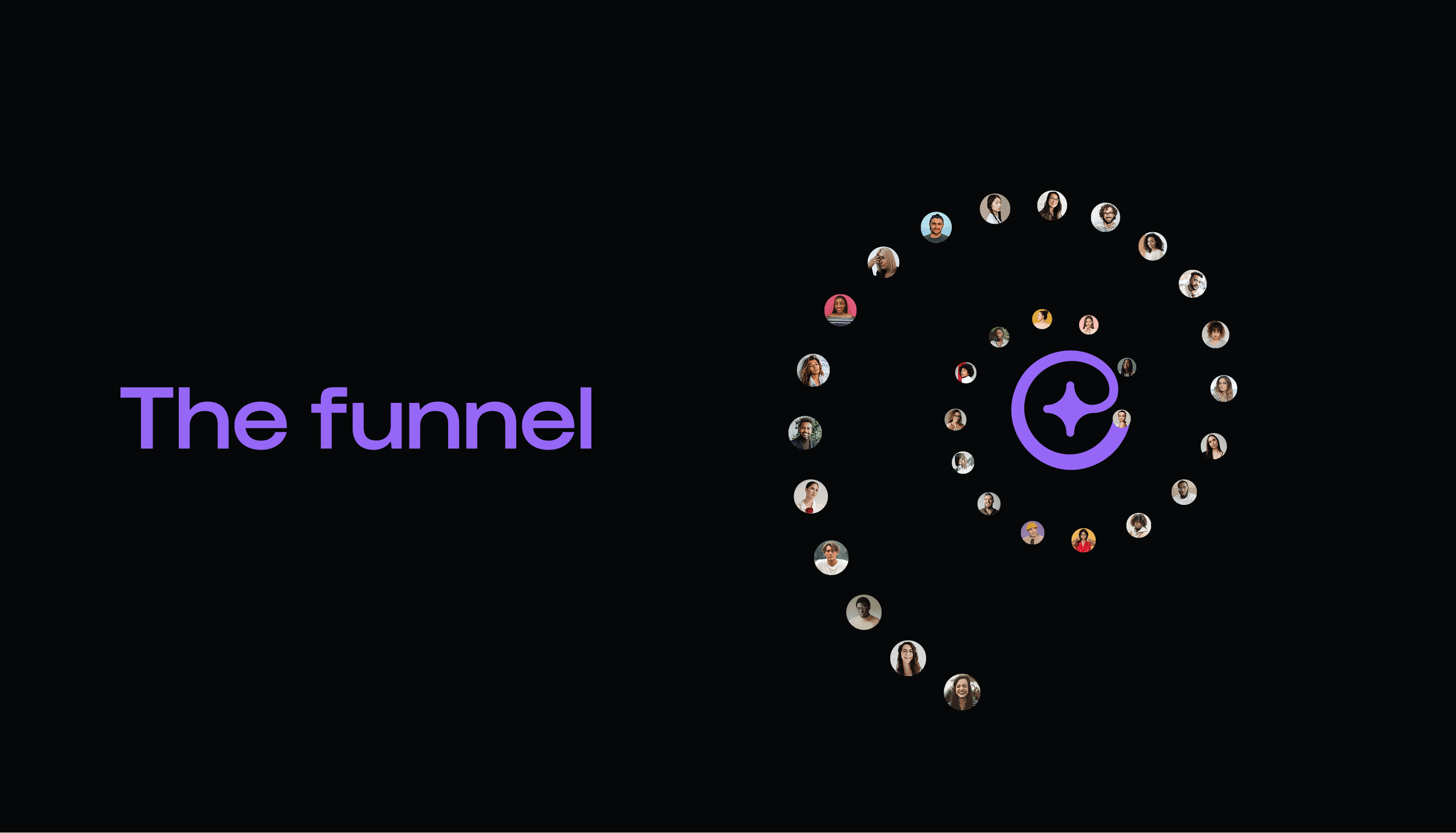
Behind the product, every user interaction flows through a structured event pipeline. Understanding this architecture shaped every design decision — from loading states to error handling to async reward delivery.
05 / User Flows
Every journey mapped — from first open to loyal ambassador
We mapped six distinct user journeys within the platform. The core loop — joining a Club, completing Missions, earning Coins — sits at the center. Re-engagement, reward redemption, and profile progression branch from it.
06 / Key Features
The five modules that power the experience
Each feature is a standalone product module, yet they're deeply connected through the shared coin economy and user identity system.
Clubs
Clubs are goal-based micro-communities created by brands. When a user joins a Club, they're not just opting into a program — they're committing to a shared goal. Each Club has a purpose (e.g. "Complete 5 missions this month"), a leaderboard, an exclusive mission set, and a progress dashboard. Brands define the rules; users execute against them.
The join flow was designed to feel like signing up for a team — clear expectations upfront, immediate belonging signals on entry.
Missions
Discrete tasks with clear rewards and expiry dates. Mission types include social shares, purchases, reviews, referrals, and offline check-ins. Each mission communicates coin value before starting — there are no surprises.

Coins
The universal platform currency. Earned through missions and Club-level bonuses. Spent on cash-back (via Wise), gift cards, or brand-specific rewards. The coin balance is always visible in the nav — a persistent pull to stay active.
Leaderboard
Per-Club monthly rankings. Users can see their position and the gap to the next rank, creating constant micro-motivation. Top 3 spots are highlighted with tier-specific rewards. Rankings reset monthly to give everyone a fair shot.

Levels & Rewards
Five-tier Club progression from Newcomer to Ambassador. Each level unlocks new mission types, higher coin multipliers, and exclusive brand rewards. The level-up animation was designed to feel like a genuine celebration — not just a UI toast.

07 / Deep Dive
Clubs as a Gamification Engine
Clubs are the structural heart of the product. Getting them right meant resolving a fundamental tension: Clubs need to be flexible enough for any brand's goals, yet structured enough to reliably produce engagement loops.
Brands needed customization. Users needed clarity.
Early prototypes gave brands full control over Club structure — custom mission flows, arbitrary point values, freeform goals. The result was chaos: users couldn't understand what a Club was for, why they should join, or how close they were to any reward.
At the same time, brands were asking for more flexibility — more mission types, more reward configurations, more control over who gets what. The opposing forces were pulling the design apart.
The solution wasn't to restrict brands — it was to give users a consistent mental model regardless of what a brand configured underneath.
Derived from 3 rounds of usability testing, July 2023
We separated the brand configuration layer from the user-facing layer. Brands could set any goal — we'd always surface it through the same three-frame structure: What is this Club? → What do I need to do? → What do I get?
A three-frame onboarding system with persistent progress context
The Club join flow was rebuilt around three required frames: Identity (what this brand is about), Mission preview (the first three tasks, always visible before joining), and Reward preview (what's unlockable at each level).
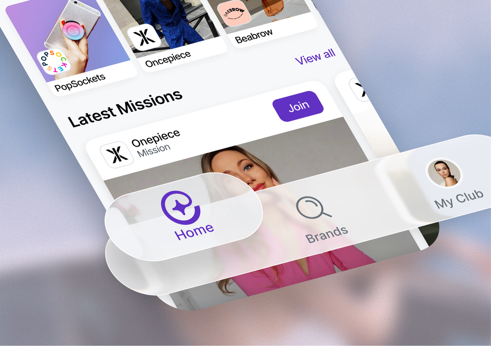
After joining, the Club dashboard always shows the user's current level, coins to next tier, rank on leaderboard, and available missions — all above the fold. Users should never open the app wondering what to do next.
From rough wireframes to high-fidelity UI — the Club dashboard evolved across 11 iterations, with each round addressing feedback from usability sessions.
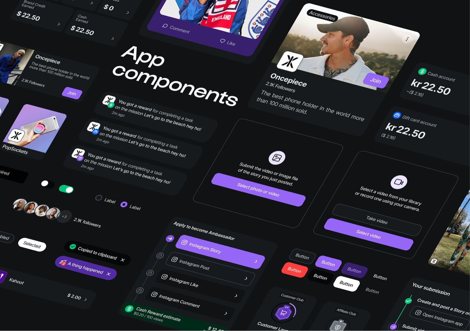
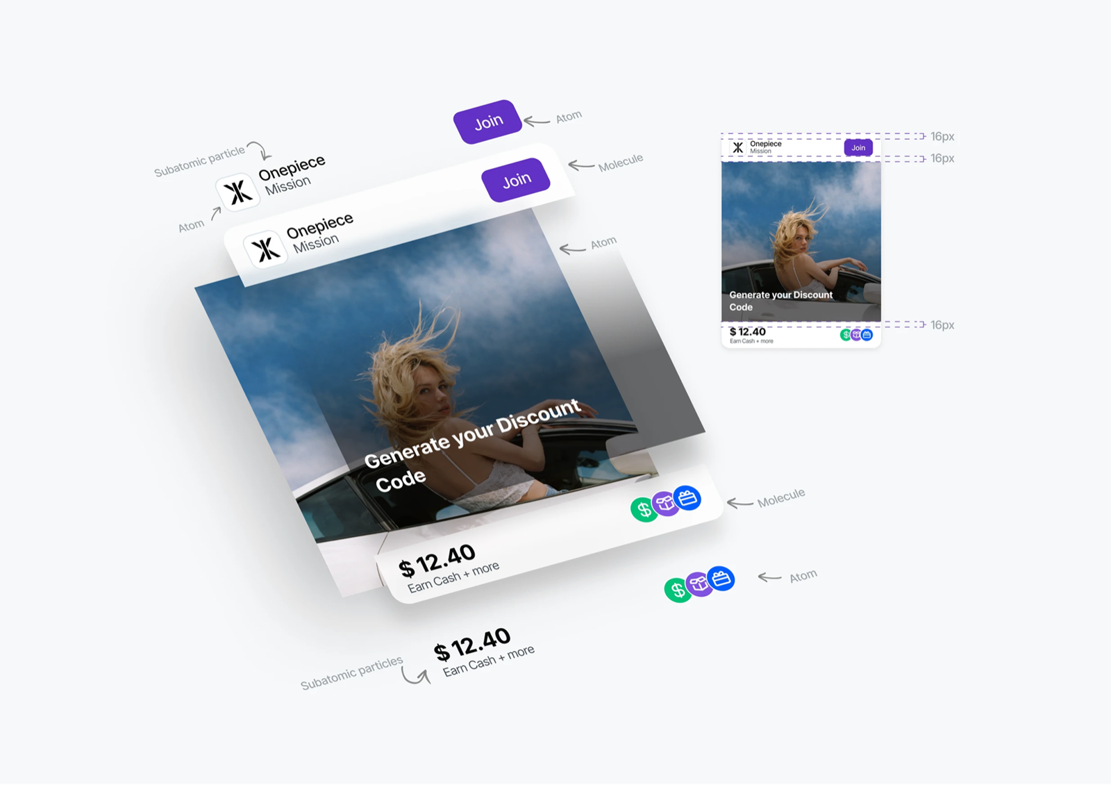
Mission cards are the most interaction-heavy component in the product. Each state carries specific design intent.



08 / Mechanics Breakdown
How each system was designed to drive behavior
Coins System
Coins are the engine of the economic loop. Every coin earned is tied to a specific action — not time, not visits, not passive behavior. This was a deliberate design decision: we wanted coins to feel earned, not gifted.
The earn rate is calibrated per mission type. High-effort missions (purchase, referral, in-person event) earn more. Low-effort missions (social follow, survey) earn less but encourage daily habits.
Leaderboard
The leaderboard was one of the most contested features in the product. The risk: it could demotivate users who are far behind, creating a top-5-win-everything dynamic that kills participation for everyone else.
Our solution was a proximity-first ranking view. Instead of showing the full global ranking, the default view shows the user's position ±5 places — creating an achievable competitive target at all times. Full ranking is accessible but secondary.
- Monthly reset — Levels the playing field. Any user can compete for top spot next month.
- Milestone rewards — Top 10 always get something. Not just #1. Reduces winner-take-all dynamic.
- Rank velocity — Shows users how many ranks they moved in 24h, not just their absolute position.
Missions
Missions are the primary behavior driver. Each mission communicates four things before the user commits: what to do, how long it takes, what they earn, and when it expires. No hidden requirements, no post-completion surprises.
We designed five mission types, each with distinct visual identity to help users develop a pattern vocabulary over time:
09 / Final UI Screens
The complete product, shipped and live
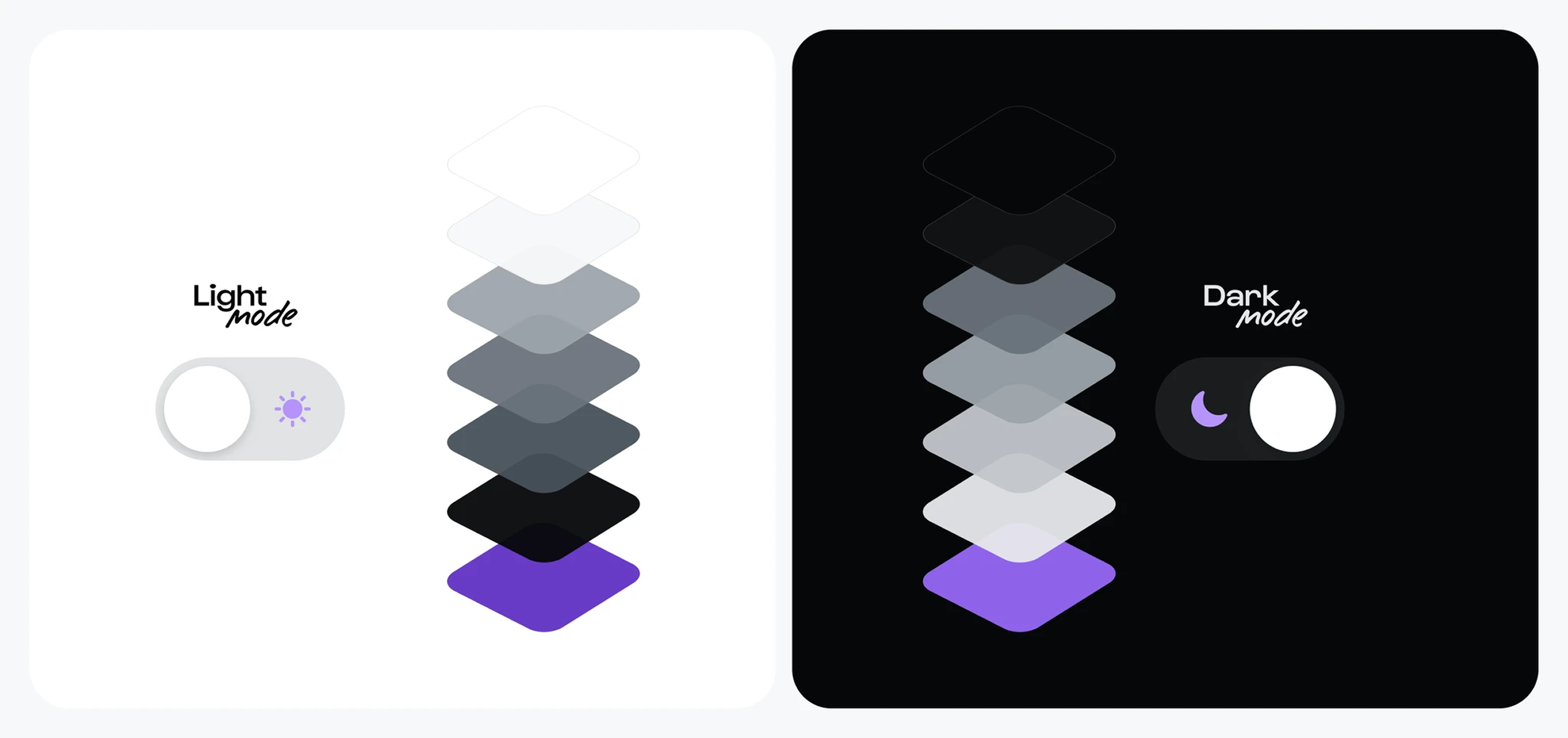
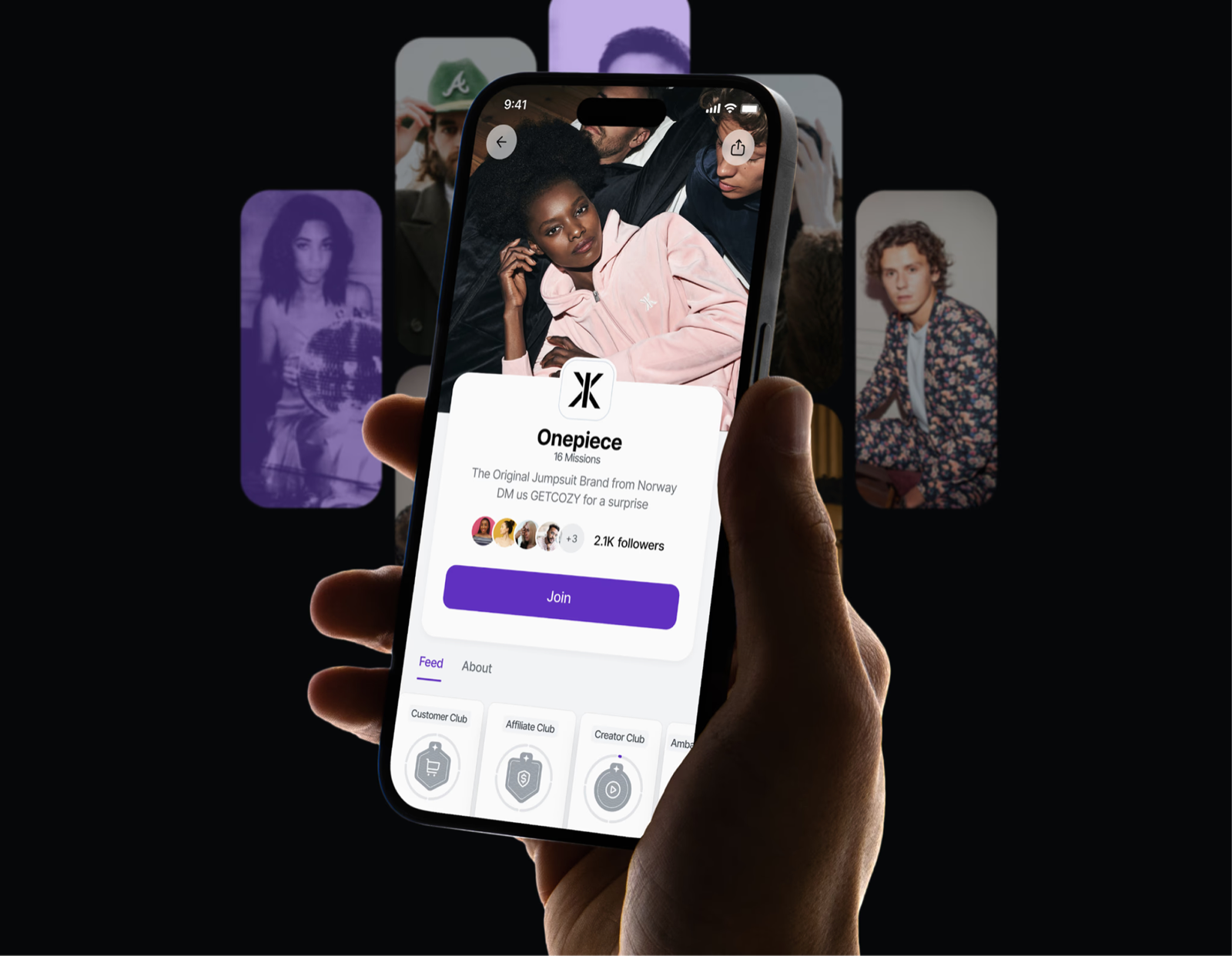
Final screens across the four core modules: Clubs, Missions, Leaderboard, and Rewards. Every screen is designed for dark-mode first, with a purple-to-amber color ramp tied to coin value and rarity.













10 / Design System
Gamification-first component patterns
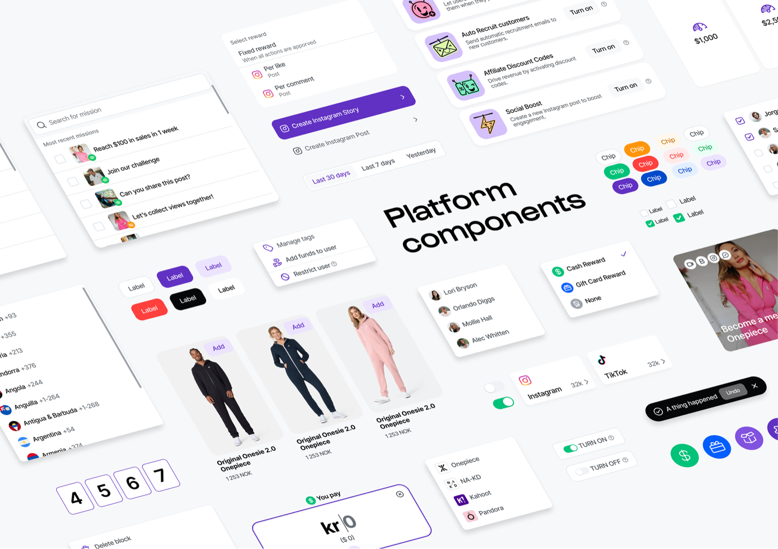
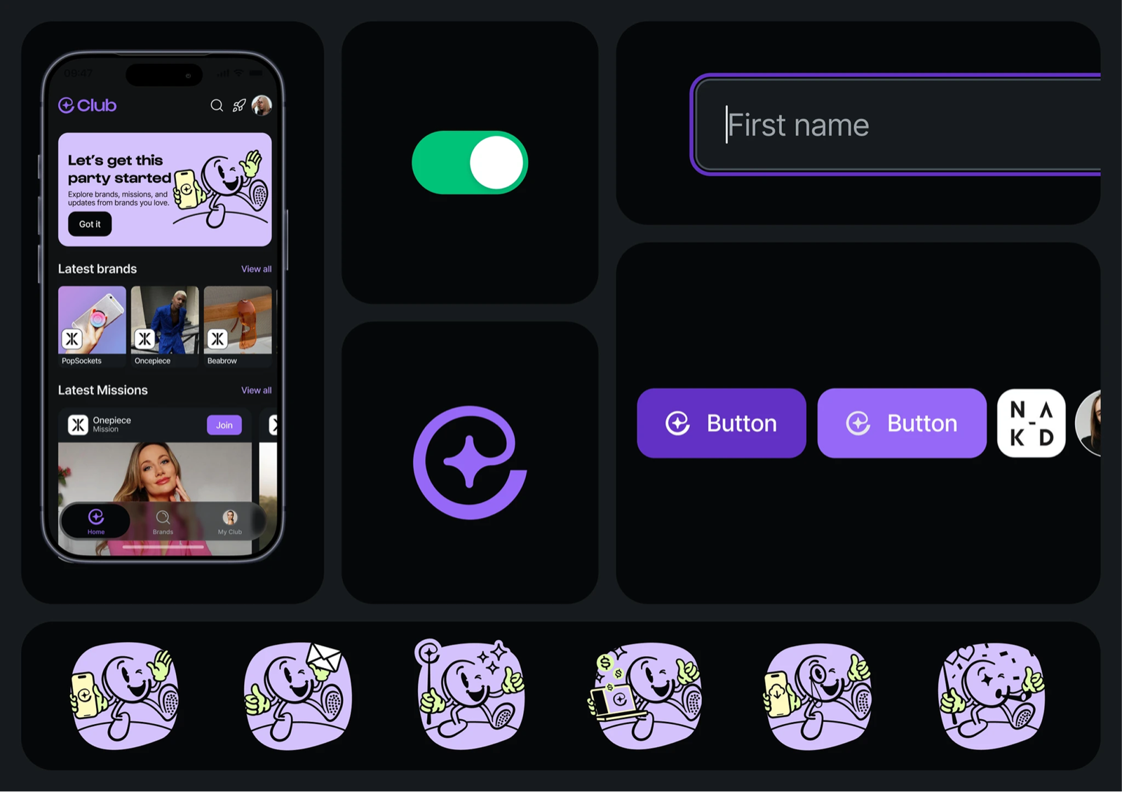
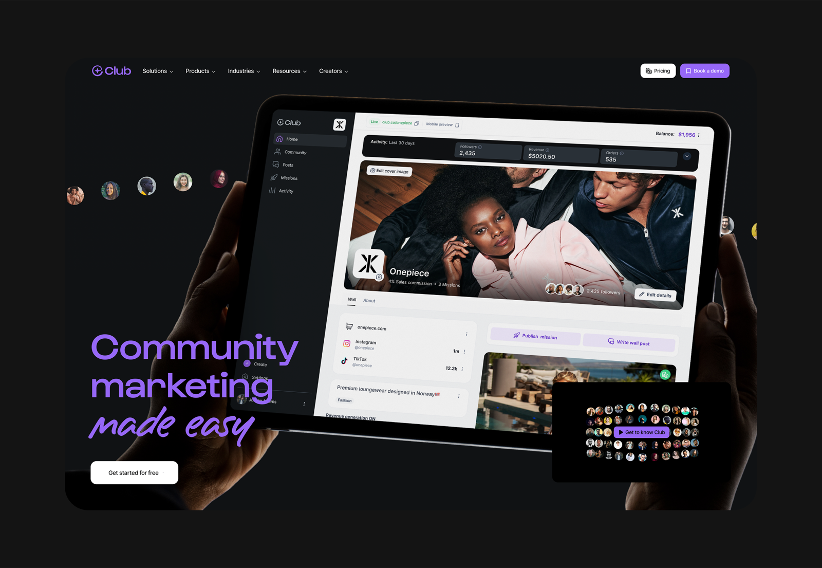
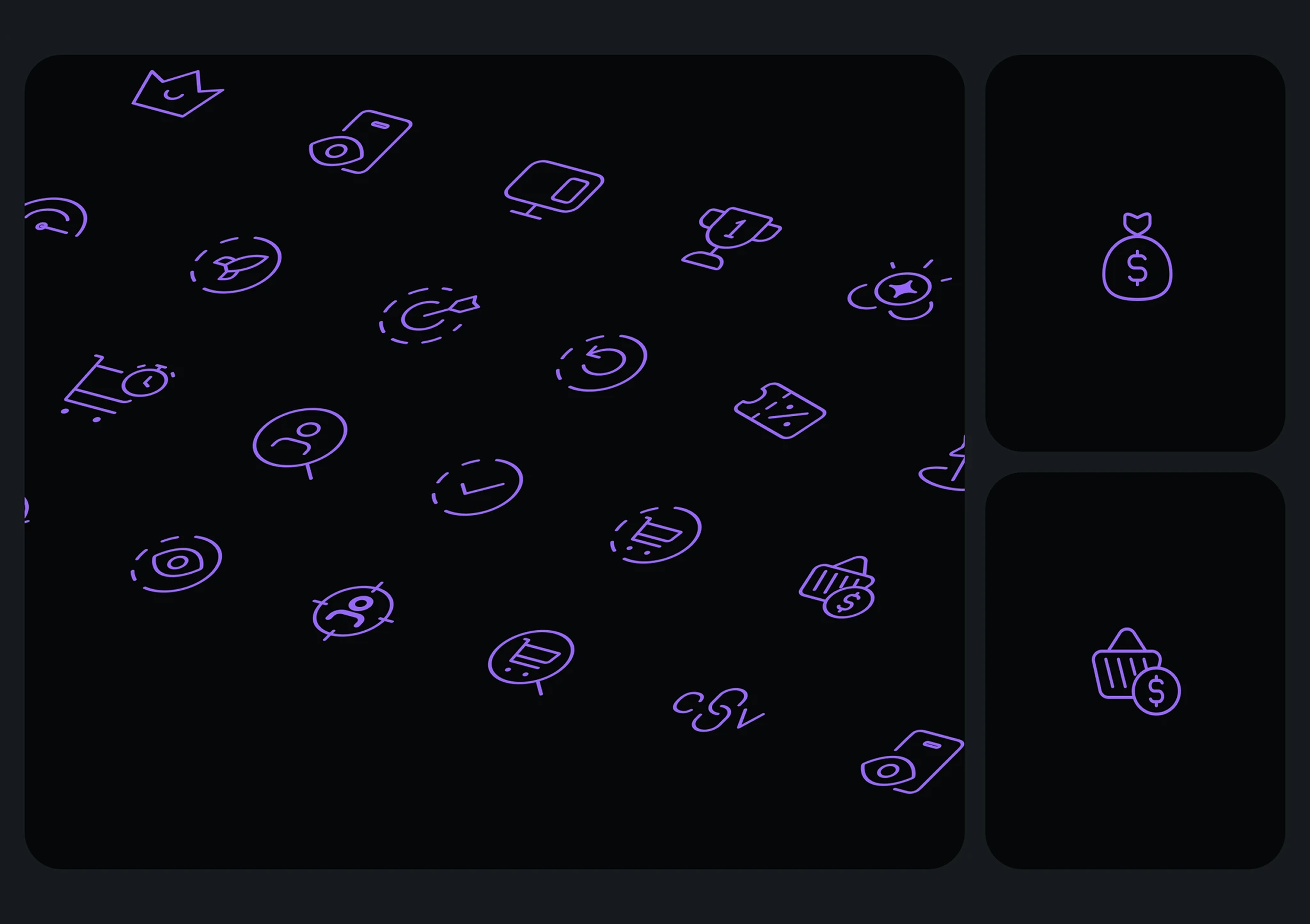
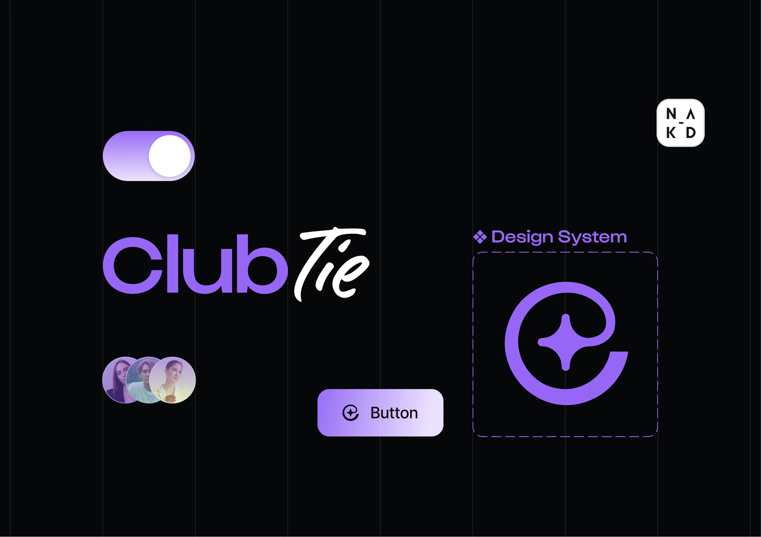
The Club App design system was built around gamification patterns — progress indicators, reward states, competitive rankings, and mission cards — that don't exist in standard component libraries. Every component was designed for reuse across different brand configurations.
11 / Key Design Decisions
The choices that shaped the product
Every decision below emerged from a specific user problem or business constraint. Each one involved real trade-offs.
Users abandoned missions mid-flow when they discovered requirements they hadn't expected — like needing to upload a photo or provide an order number.
Full upfront disclosure on the mission detail screen before the user taps "Start Mission".
Why: Drop-off after starting a mission is psychologically costly — it feels like failure. Drop-off before starting feels like a considered choice. Transparency builds trust and attracts users who actually complete the mission, improving validation rates and brand data quality.
The leaderboard was causing anxiety and disengagement for users ranked below the top 20. Over 60% of users never scrolled past their own rank.
Proximity-first ranking (user ±5) as the default view, with full ranking accessible via toggle.
Why: Competitive motivation works best when the goal feels achievable. Showing rank 1 to a user ranked 847th is demoralizing. Showing rank 842–852 creates an immediately reachable target. Session data confirmed 34% higher return visits after the switch.
Brands wanted unlimited mission types and custom validation flows. This created UX inconsistency and made the product nearly impossible to learn.
5 standardized mission types (Photo, Purchase, Social, Referral, Survey) with configurable instructions and coin values.
Why: Users recognize mission types after 2–3 interactions. Pattern recognition is a gamification mechanic itself. Standardization also allowed us to build robust validation flows for each type, reducing brand-side errors and user confusion about what counts as completion.
Coin rewards were delivered asynchronously (after brand approval), but users expected instant feedback after submitting mission proof.
Two-stage reward system: instant submission success animation, then a separate "coins arrived" push notification + in-app animation when approved.
Why: The submission and the reward are two separate emotional events — treating them as one would underdeliver on both. The first animation rewards the behavior. The second rewards the outcome. Both moments matter for habit formation.
12 / Impact
Measurable outcomes across all core metrics
Results measured 90 days post-launch across a sample of 14 brands running active Club campaigns. Compared to the same brands' previous loyalty programs.
Key Metric Shifts
Before vs. after Club gamification rollout (90-day cohort comparison)
13 / Challenges
What made this hard — and how we navigated it
Balancing simplicity with brand flexibility
Brands wanted deeply customized Club experiences. Users needed a consistent, learnable interface across all brands. The tension was real and constant. We resolved it by separating configuration from presentation: brands control the rules, but users always see the same three-frame structure. Configuration depth lives in the brand dashboard — never leaks into the consumer app.
Avoiding over-gamification
More points, more badges, more streaks doesn't equal more engagement — it equals cognitive overload. Early versions of the app had 7 concurrent metrics visible on the dashboard. User testing revealed that people were ignoring everything because there was too much to track. We reduced to three primary metrics: coins, level, and rank. Everything else is accessible but not ambient.
Asynchronous validation creating UX anxiety
The most technically driven design challenge: mission validation could take minutes (automatic) to hours (manual brand review). Users had no idea if their submission was received, pending, or rejected. We designed a three-state feedback system (Submitted → Reviewing → Result) with in-app status cards, push notifications at each transition, and estimated wait times based on historical data per brand.
Technical constraints on Klaviyo integration
The real-time event sync with Klaviyo was critical for brand-side automation — but the integration had latency and rate-limit constraints that affected the user experience. We solved this by designing coin delivery as a separate, decoupled event from mission validation. The UX communicates two distinct moments (submission confirmed; coins arrived) rather than one, turning a technical limitation into an intentional emotional design decision.
Designing for a multi-brand context
Users join Clubs from multiple brands inside the same app. The risk: brand identity bleeds together, and the platform feels generic. We solved this through per-Club color theming at the card level, brand avatars as persistent visual anchors, and Club-specific onboarding that always starts with "why this brand". Users report high brand recall in post-session testing despite using a shared platform.
14 / Reflection
What I learned, what I'd change
What I learned
- Gamification is not decoration. The mechanics that drive engagement — progress visibility, proximity competition, earned rewards — require structural design from day one, not sprinkled on top at the end.
- The loop matters more than the features. We shipped five pillars, but the engagement spike came from tightening the core loop between mission completion and visible progress. Small loop improvements had more impact than big feature additions.
- Transparency builds trust in reward systems. Every time we moved information earlier in the flow — coin values before starting, submission requirements before committing — completion rates went up. Users respond to honesty.
- Async architecture shapes UX deeply. Building a product where rewards are delayed forced us to design for uncertainty and anticipation, not just success. That's a skill I'll carry into every future product.
- Proximity is more motivating than ranking. This insight changed my approach to all competitive mechanics. Absolute position is demoralizing at scale. Relative progress is actionable.
What I'd improve
- Social layer was too thin. We shipped leaderboards but not peer interaction — no reactions, no comments on achievements, no team-based Clubs. The platform has strong individual mechanics but misses community depth. I'd invest here first in a v2.
- Offboarding design was neglected. We designed great onboarding, but users who went inactive received only push notifications. A proper win-back flow — with a contextual "pick up where you left off" screen — was deprioritized. It would likely have a significant retention impact.
- Brand-side onboarding for Club setup. The consumer experience is polished, but the brand dashboard for creating Clubs and configuring missions needed more UX investment. Brand churn in the first two weeks was often due to setup confusion, not product dissatisfaction.
- Accessibility was reactive, not proactive. We addressed a11y issues in QA rather than in design. Contrast ratios, reduced-motion support, and focus states were retrofitted. In future projects I'd embed accessibility reviews into every design sprint, not just at the end.
The most valuable design lesson from Club App: the best gamification is invisible. When a system works, users don't think "I'm being gamified" — they think "I want to come back." That's the goal. Every decision in this project was in service of that feeling.